The mistakes artists make when creating icons for game items
A while back we held a BootCamp for 2d artists. In this article we will share feedback that SunStrike specialists gave on the test works of artists, which they had to perform to get into the BootCamp. We will analyze the main mistakes that artists make when creating icons of game items.
Part 1. Work on geometry
Foreshortening and space filling
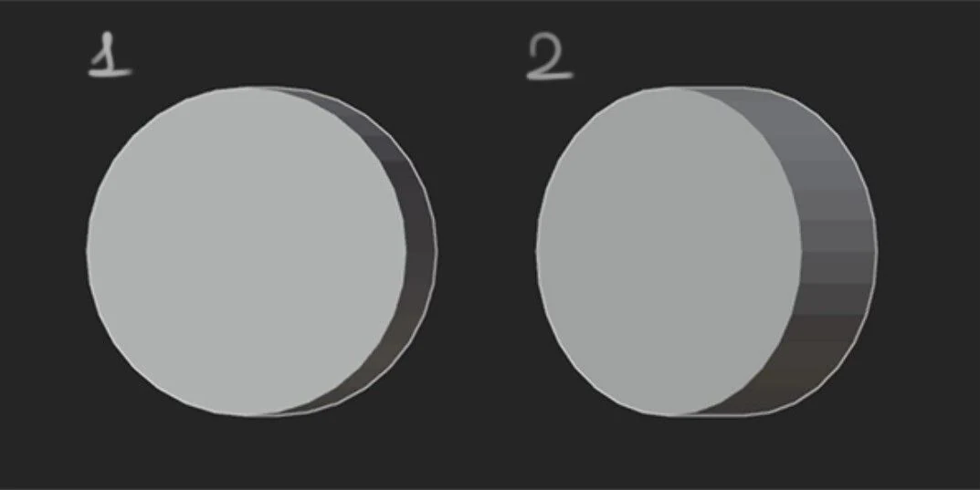
In this step, we work with construction, angle selection, and composition in the square (making the object fill the imaginary square).
Let’s break down each component separately. First up is the “foreshortening”. When choosing a foreshortening, we should show the object in such a way that as many of its details as possible are visible. At the same time, the object should be slightly rotated so that it seems more voluminous and fills as much space as possible in the imaginary square.
What is this “imaginary square” you ask? Icons are made for different purposes. For games, for websites, applications, etc. And there they are not “floating in space”. In games, for example, they are often inscribed in a square/circle/oval or other geometric figure.
What mistakes do candidates make at this stage of work?
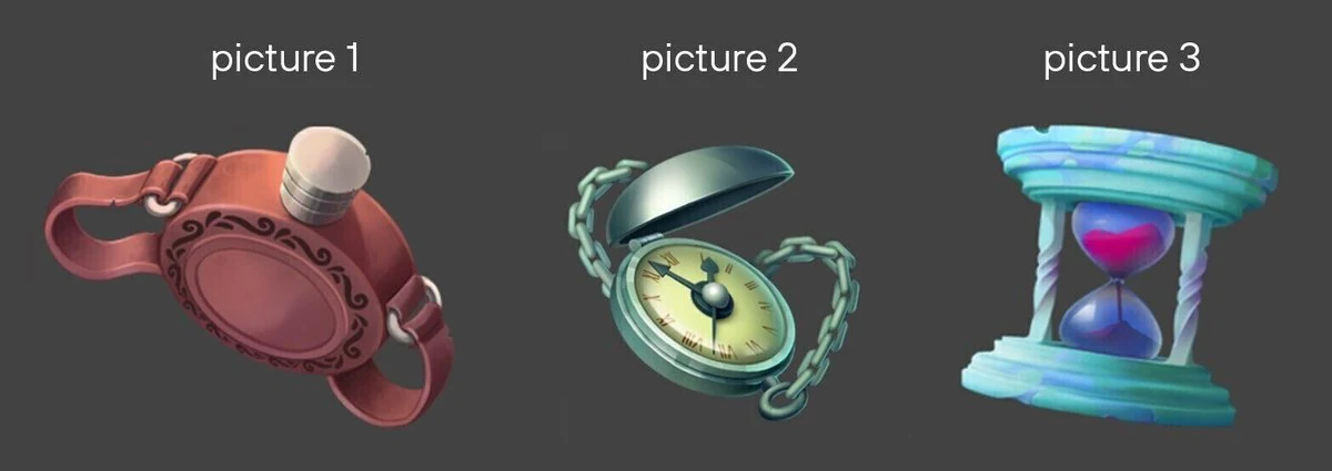
Let’s consider three test cases.
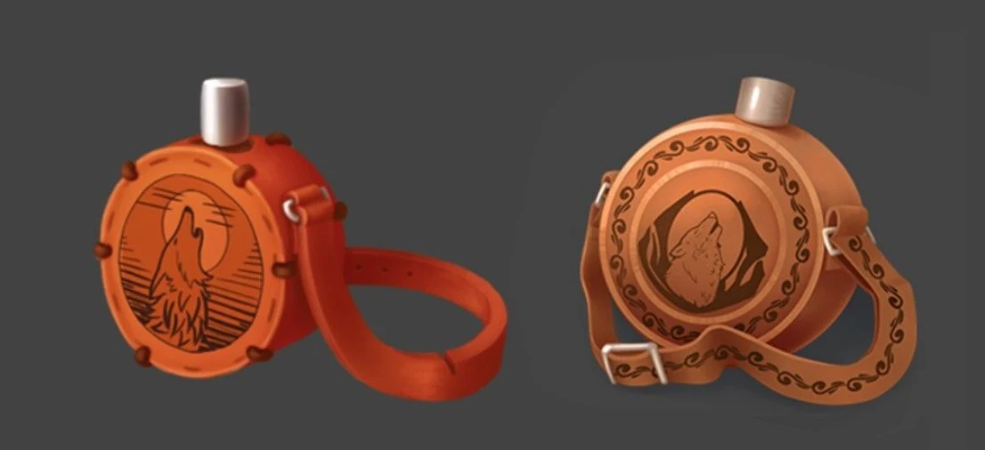
Picture 1. The angle strongly emphasizes the lid of the flask. But the emphasis should rather be on the “belly” of the flask, where the pattern will be depicted. Plus, the imaginary square is poorly filled in here. It leaves a lot of empty space.
Author: Lyubov Kolodeznikova. Link to portfolio
Picture 2. This is a very nice icon. It is a good view of the object and fills our square, but the emphasis is on the corner of the lid, not on the dial, which is the main part of this object.
Author: Anastasia Efremova.
Picture 3. Here, too, everything is good, but because we see only the front part, we want to turn it a bit either towards us or away from us to see the flat surface of the clock. And if you draw lines down the center of the object, you can see that the clock is symmetrical. Such symmetry is better to avoid in the drawing, because it makes it look unnatural.
Author: Yana Khoruzheva
Let’s now try to correct the angle to make the works look more favorable.
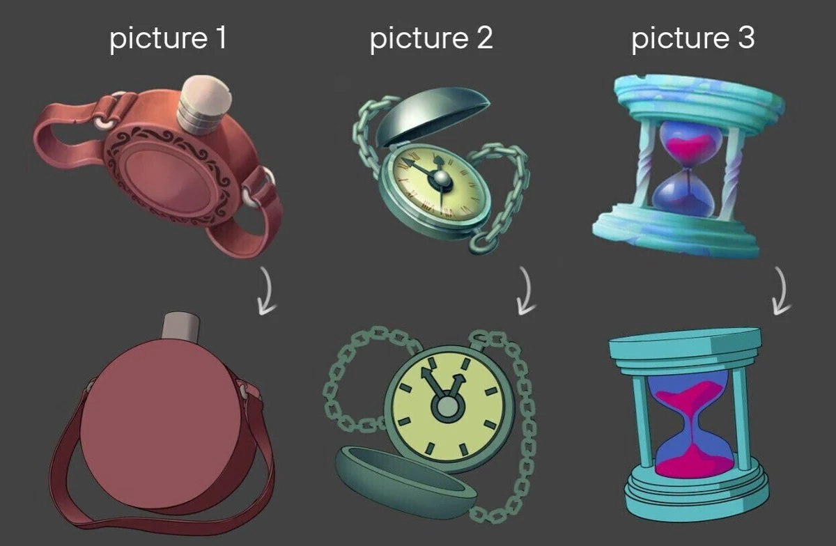
Here we tried to show a more suitable angle for these icons.
In the first image the flask now has a better view of the “belly”. Now we can show a pattern on it and emphasize the “belly” with lighting. In the second picture we can see the clock face better at the new angle. We can also emphasize it with lighting. In the third picture the clock is turned to show the upper plane. This makes the picture more three-dimensional.
Each part of the picture should work to enhance it. In this case, to make the object more readable. Now let’s talk about the size of the parts.
Dimensions of parts
The type of rendering of objects from our examples is not realistic, but also not too stylized. When working out the details, you should not go to extremes, making them too cartoonish or hyperrealistic. Now we will look at some examples where the size of the details was not depicted correctly.
When drawing an icon, it is advisable to always put it next to the references to see if you are going in the right direction. This is what we will do.
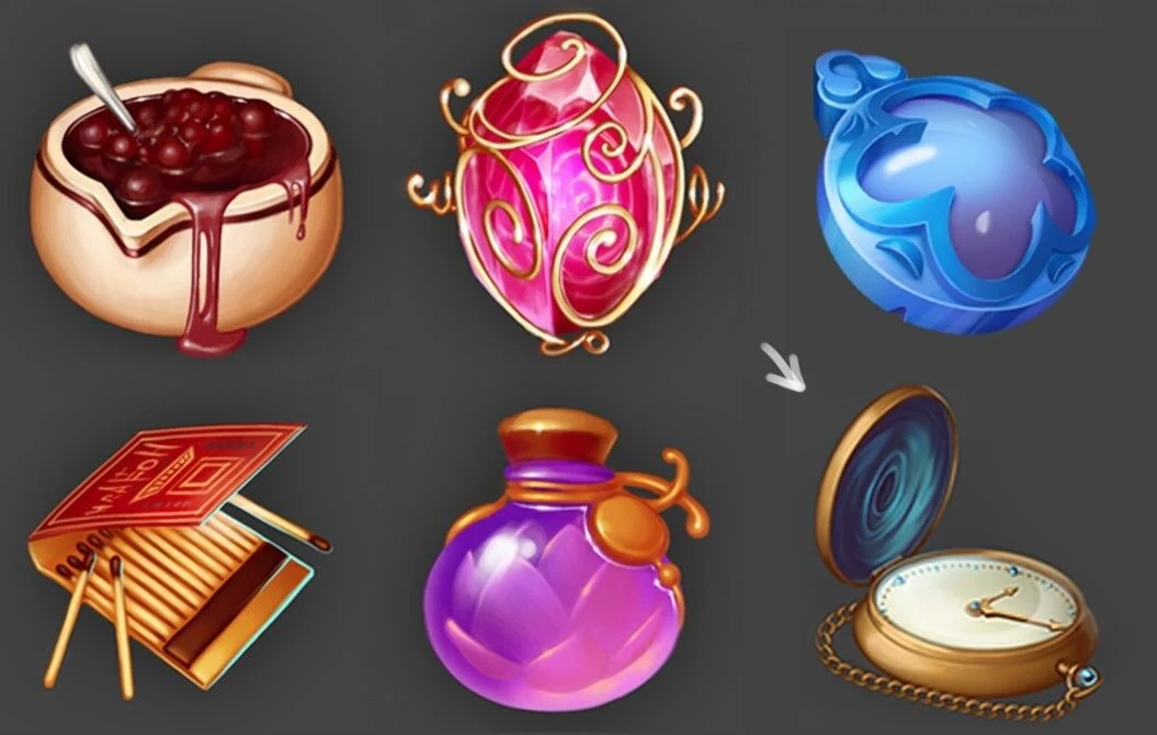
Let’s take the references from our examples and insert the candidate’s work instead of one of them (bottom row, right icon). The work turned out to be interesting, but the chain and the dial slightly sags because of their size. How can this be corrected?
We slightly increased the size of the chain and dial elements. Now the object looks better in terms of detail. Of course, correcting only the detail is not enough. We need to correct the angle and colors as well.
Constructing
Working with the construction is also very important, because due to the divergence of perspective of the elements of the object, the perception of the object is impaired.
In front of you are the works of two candidates. Icons by angle, colors and detailing turned out very cool. But there are problems with geometry construction. Let’s look at the first work.
On the left we see the work itself, and on the right:
1. What this object is conventionally supposed to look like.
2. The way he looks now.
Plan of edits:
- Show the direction of the cylinder.
- Draw ellipses.
- Correct the flask.
- Slightly correct the strap (so that the object fits into the square).
We show you the result in the form of a Gif file.
Now let’s look at the second job. Here is a similar situation: the cylinders of both the body of the flask and the lid are not quite correctly aligned. Regarding the body, the cylinder turning was not taken into account, so the side could appear unnaturally massive. A slight reversal of the cylinder, like the second icon, would have a reversal like the first example with the 3d picture. We will see a more massive side when the cylinder is rotated more forcefull.
Plan of edits:
- Reducing the sidewall.
- Show the top plane of the lid.
- And taking this opportunity to also try to fit the strap into the square.
Geometry done, now let’s move on to color.
Part 2. Color
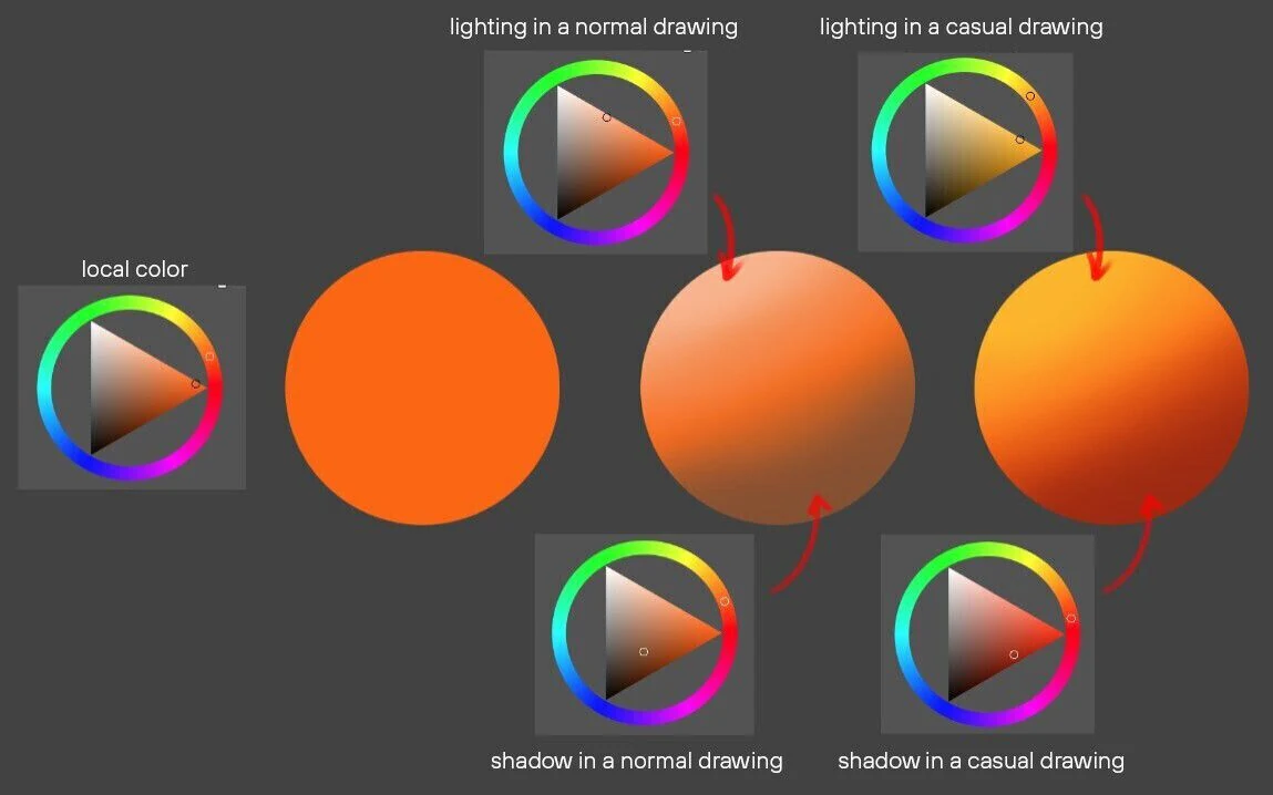
Let’s start with a brief theory. Probably many of you have studied color by sketching from life. Redrawing photos, still lifes, works of masters of painting, carefully looking at colors. Unfortunately, in casual game graphics colors work a little differently than in traditional painting.
For example, let’s take an orange ball. In normal lighting, its shadow will remain orange, but will be darker and less saturated. In casual graphics, the same orange ball will use more red colors in the shadow and more yellow colors in the light. That is, to make the color lighter or darker in tone we must also change shades. This creates the colorfulness of the style.
Let’s take a look at the candidates’ work.
In both the first work and the second, the colors are not quite right.
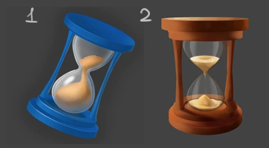
Let’s take the 1st watch.
Author: Daria Kudrina.
The main problem here is that the colors do not render the lighting well. There is no clear separation between light and shadow. In the suggested edits below, we have emphasized the lighted and shadowed parts of the object. To draw light for the blue object, you need to go towards the blue color. And don’t be afraid to use saturated colors, so the graphics will become more casual.
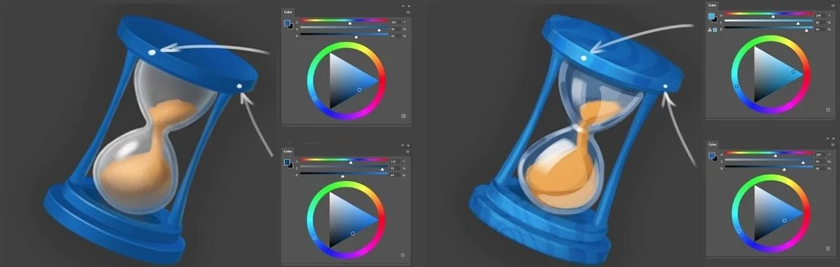
Let’s do the same for the 2nd watch.
In the case of orange, a color closer to yellow for the lighted side and a color closer to red for the shade. Also remember to use saturated colors.
Author: Valentina Piskunova.
Part 3. Material Render.
No matter what kind of object we draw: a spaceship, a superhero, a monster or a bottle, it all consists of some kind of materials. And if you don’t have to pay much attention to materials to work with concepts, then rendering them is crucial for drawing a full-fledged game icon.
Materials come in many forms and to show them, you need to do a little research for yourself. What makes metal metal? What is the visual difference between yellow plasticine and gold? What strokes in a drawing make stone a stone and wood a wood? Once you identify these nuances, you will find it easier to draw materials.
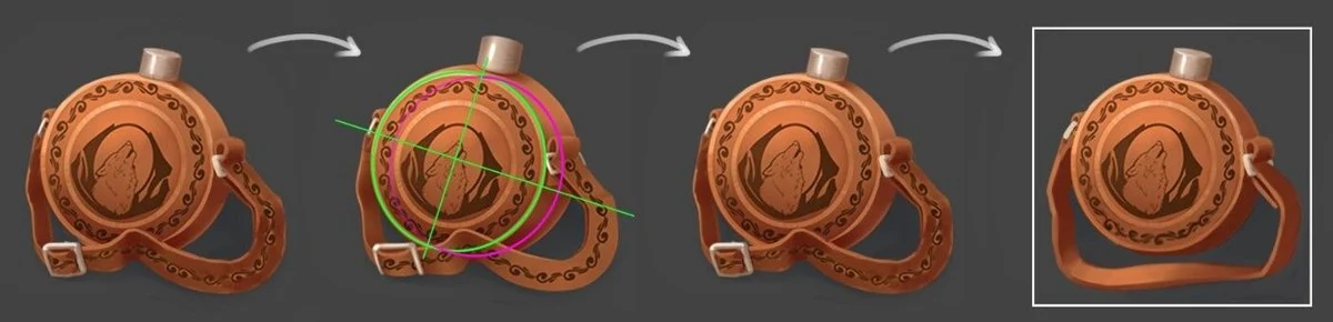
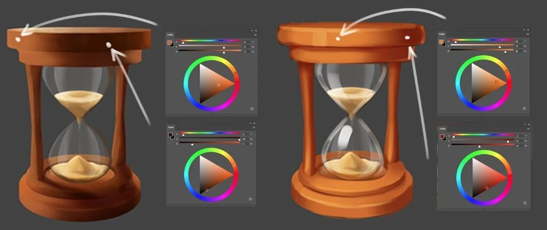
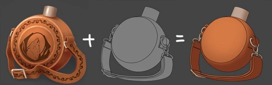
Let’s take one of the flasks from the last example and try to improve it, including working on the materials. First of all, let’s look at how the flask looks together with the icons on the reference.
It looks good, but what could be improved:
- Slightly correct the subject’s angle and construction to make it look more toward the light, and show the underside and sides of the subject;
- Correct the curve of the strap so that the flask fits better into the square;
- Show the difference in materials between leather and metal more strongly;
- Add a light source at the back to make the shape read better.
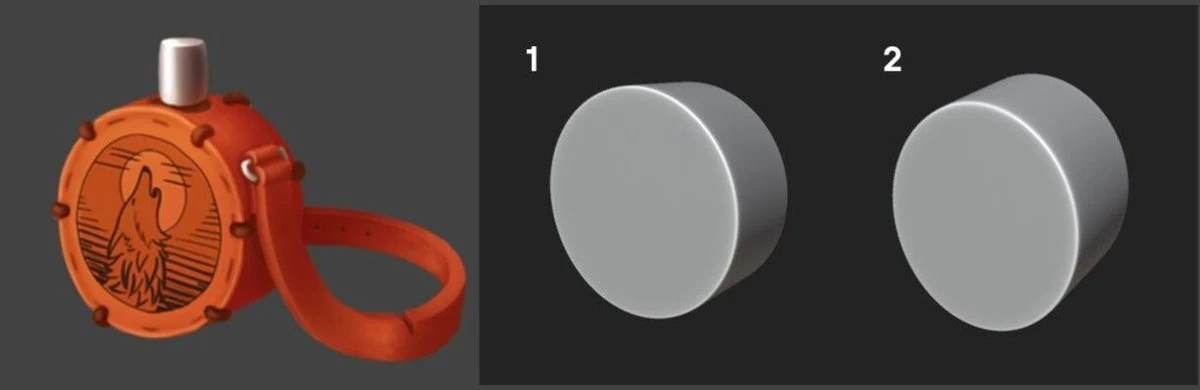
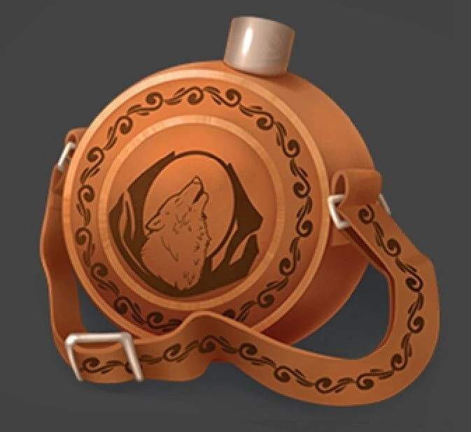
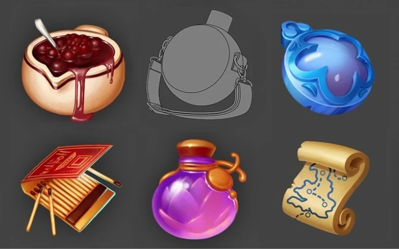
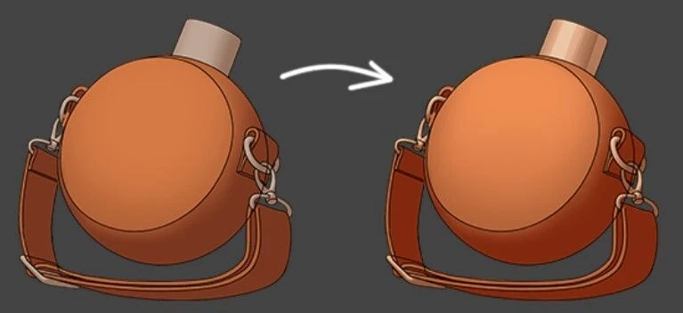
Let’s get started! In order not to waste time and effort on the construction, we will trick and play with 3D.
Our curator created a very simple 3d model in Blender, close in proportions to the original icon, and exposed it in the foreshortening. What can be fixed here:
- Slightly tilt the model to the right so that it has the same direction as the map icon;
- Slightly increase the thickness of the lid to stylize it more closely to the references;
- Turn the face slightly toward us.
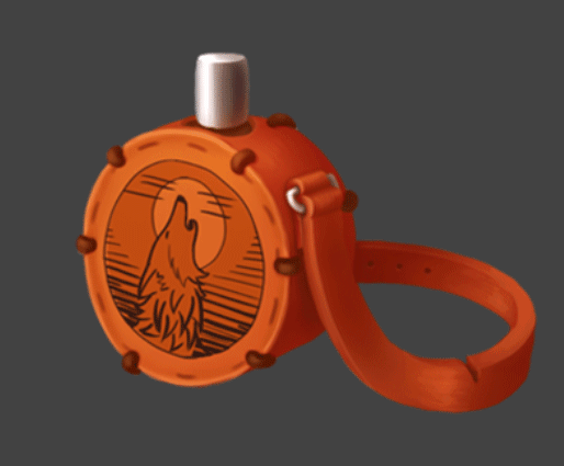
And this is what we get, leaving room for a future strap.
Now, having worked a little with the linework and composition we got such a blank:
Let’s move on to color. Let’s try to use the colors from the original icon.
The colors are very good. To make them better, you should work with saturation and brightness. The matte glare can be made even brighter and a bit cooler. The shadow could be made a little redder and more saturated. The metal is now going gray, so you can also make it a little more saturated.
Add occlusion and remove the lane.

Now it’s time to add the wolf image and related details to the skin. We will also slightly correct the strap, as we have an unnatural “straight” angle at the bends.

Now we need to refine the texture, add rim light and accent the center part of the work. With the texture will have a little bit of work, because in the center there are a lot of details and their addition can make the picture very noisy. So you have to be careful. Plus, to make the leather material more readable, let’s add a seam on the side of the flask.
That’s all for now. We hope this article will help you to successfully pass the test assignment to our BootCamp for 2D game art next time.
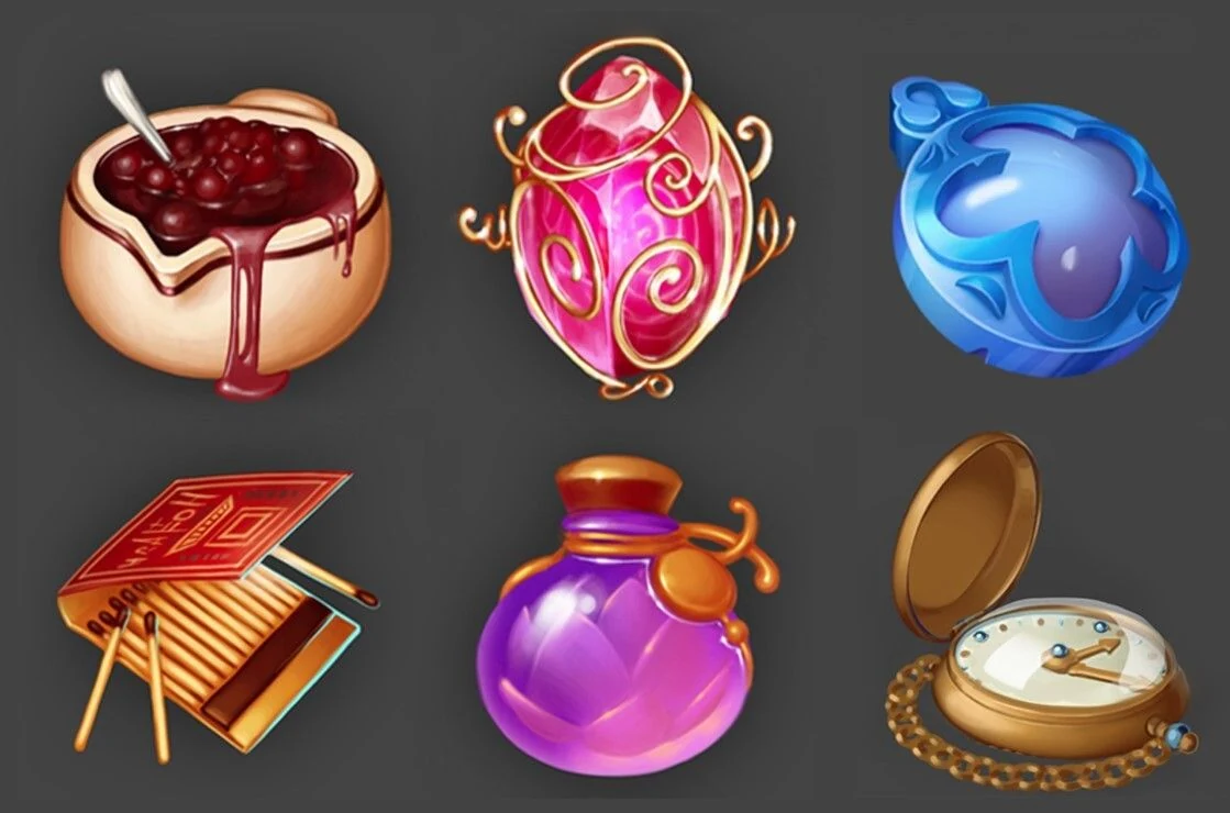
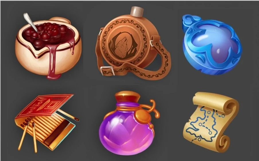
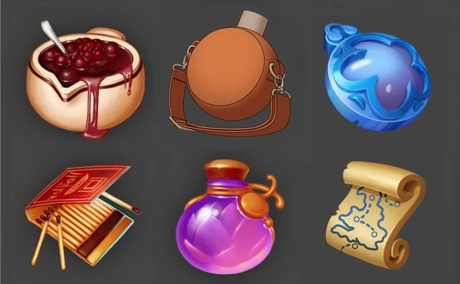
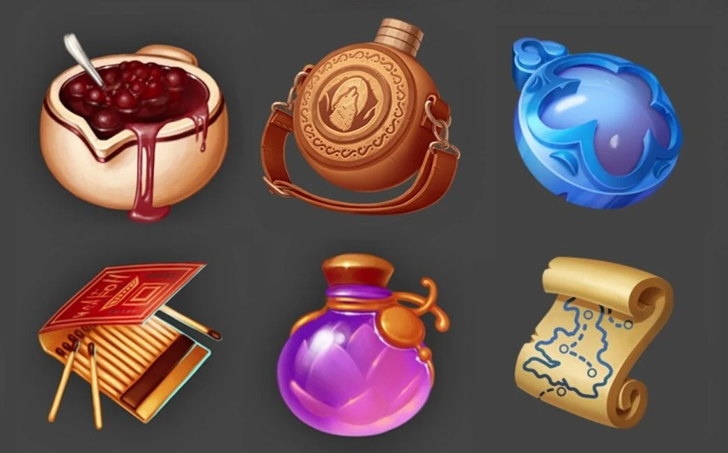
P.S. In the examples, which was given to the BootCamp participants, as an example of icons we took the works from free access by Evgenia Obukhova.
If you need professional support with game concept art and design or full game character art design for your project, the SunStrike team is ready to help.
Thank you for your attention!