
What to pay attention to when designing props?
Hello, everyone! SunStrike Studio creates graphics for mobile and computer games. Below you will find detailed feedback on one of the tasks performed as part of our open test assignment. The author of the work has given us permission to publish this information.
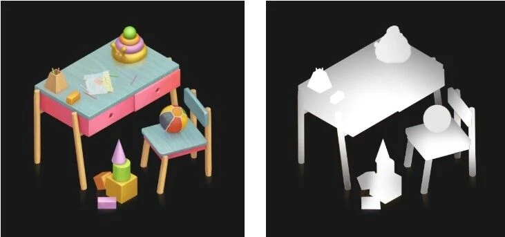
Functionality
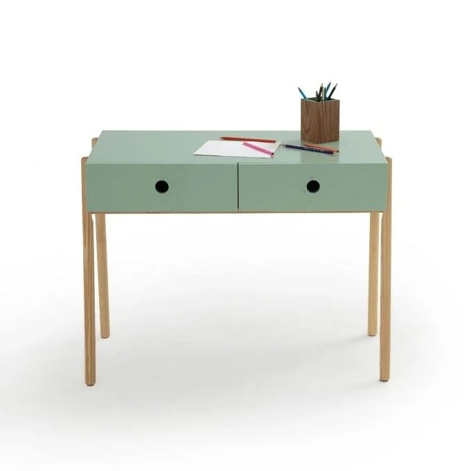
If we look at the reference, it might seem that the children’s table from LA REDOUTE INTERIEURS is one solid object except for the two drawers that divide it in half:
If you, however, look for references via the Google image search function, you’ll see that it is possible to find an image where this specific table or a similar model has the drawers pulled out:
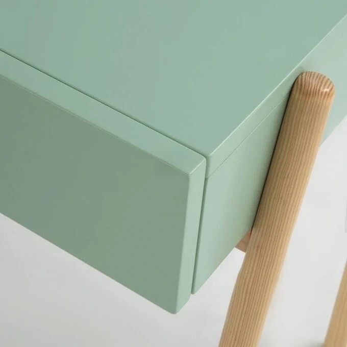
It may seem like an unnecessary and uninteresting detail, but these types of elements are quite often animated and the technical artist might come back asking for additional information as to how this object works.
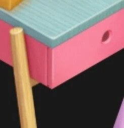
Of course, it’s pretty easy to fix:
Lighting
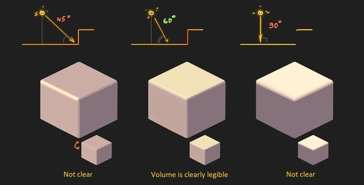
Most casual projects for the mobile market place the light at a 60 degrees angle to the horizon and the cube, representing the orthogonal area of the playing field.
Why is that? As we can see, at 45 degrees the lower and side planes will merge together, while at 90 degrees (light from above) all side planes will do the same. In relation to a single cube, light is usually placed in such a way so as to make sure that the two sides have a noticeable difference:
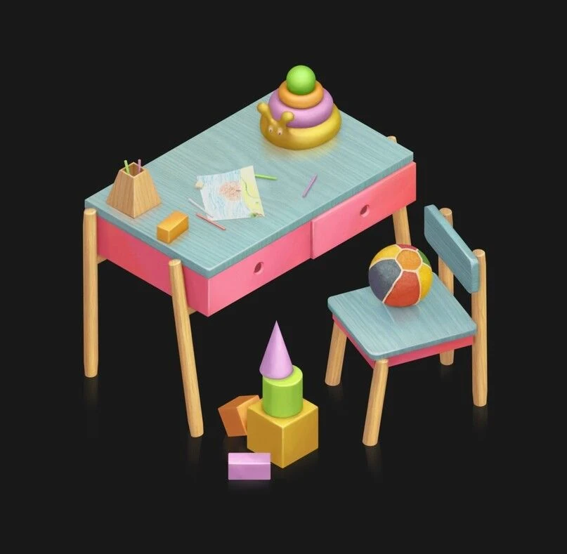
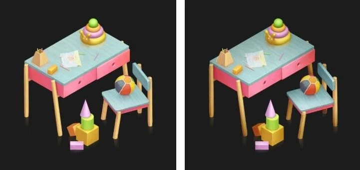
When we take a look at the test task, we can see that this rule is being followed, but that some of the elements were not done carefully:
- The side and front planes of the tabletop and the legs of the chair blend together
- The light on the pyramid and the cylinder from the set of cubes does not come neither from the left nor from the viewer
- In some spots the surfaces that are facing down are not illuminated correctly (left legs of the chair).
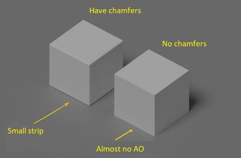
These are small errors, however, they do a good job illustrating how to scrutinize objects plane by plane:
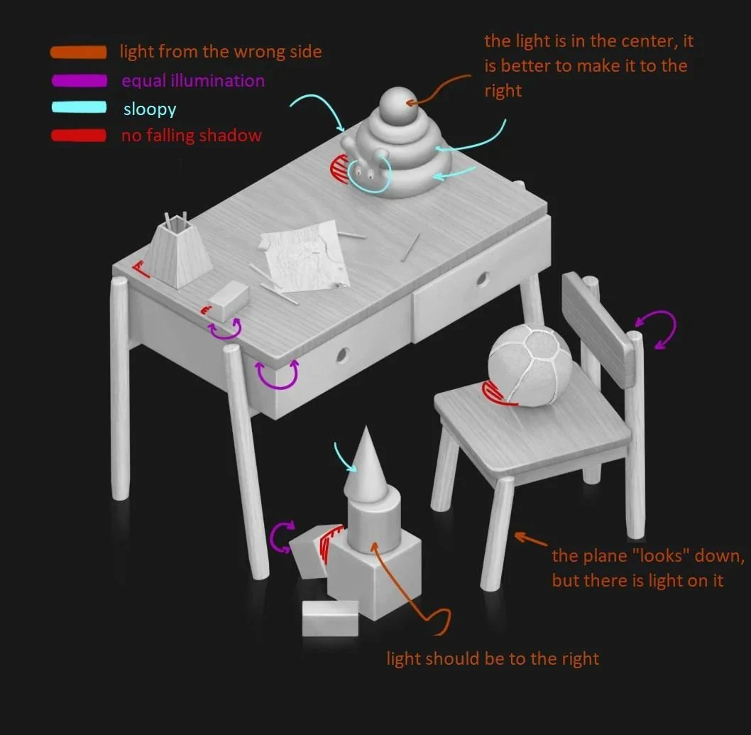
It would also be useful to reduce the size of the occlusion where the objects are placed against each other on the lighted side:
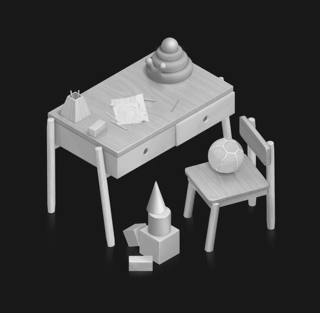
When viewed in black and white the resulting work should look as follows:
Checking in Small Size
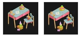
Very often large objects look fairly clean and easy to understand. On mobile, however, some details might disappear or look very weird to the audience. Here we can notice that the colors of the pyramid are hard to see and have blended together into a gray mass. The pencils have disappeared all together:
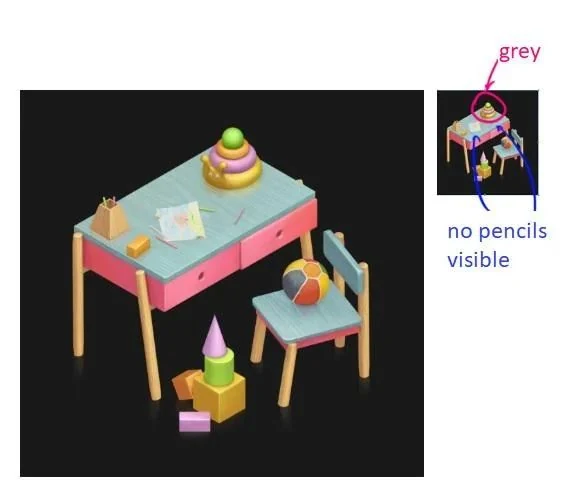
By increasing the level of saturation, we can try to “pull” these elements back. Adding a little color to the ball will also make the picture look less “wilted”:
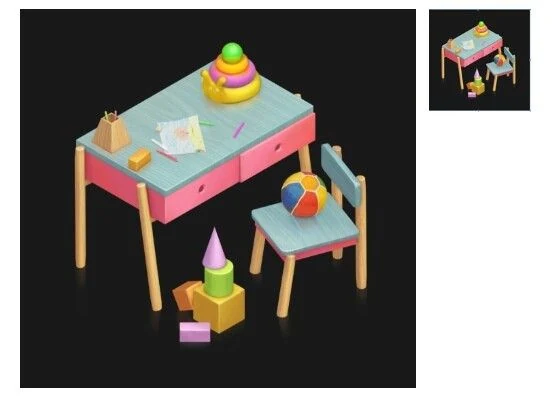
To check the images in small size, simply create a new window and reduce it in size:
Depth
Elements in casual games are usually designed to make the user want to touch them. This is why many of the collectable items look a little like the miniatures from the Kinder Surprise eggs:
Unfortunately, a part of the space ends up being lost in the isometry, so local depth ends up being used to indicate volume instead:
It’s kind of like z-depth except for the fact that each of the large items has a depth of its own. As a rule, small objects do not have individual depth. Otherwise they end up looking more dimensional than the overall item and start “living a life of their own”.
The picture below to the left is the original. On the right the image has a local depth applied to it in multiply mode:
Translucent Objects
As a rule, materials with a strong translucence (plastic, fabric, straw, cheese, etc.) are illustrated differently than solid objects. They usually look more airy and lightweight than hard materials such as wood and building stone. Despite the fact that in real life such materials follow principles of light distribution (the thinner the shape and the closer to the surface through which the photons pass, the more visible the translucency), in casual graphics the objects are simply illuminated and saturated across the entire surface:
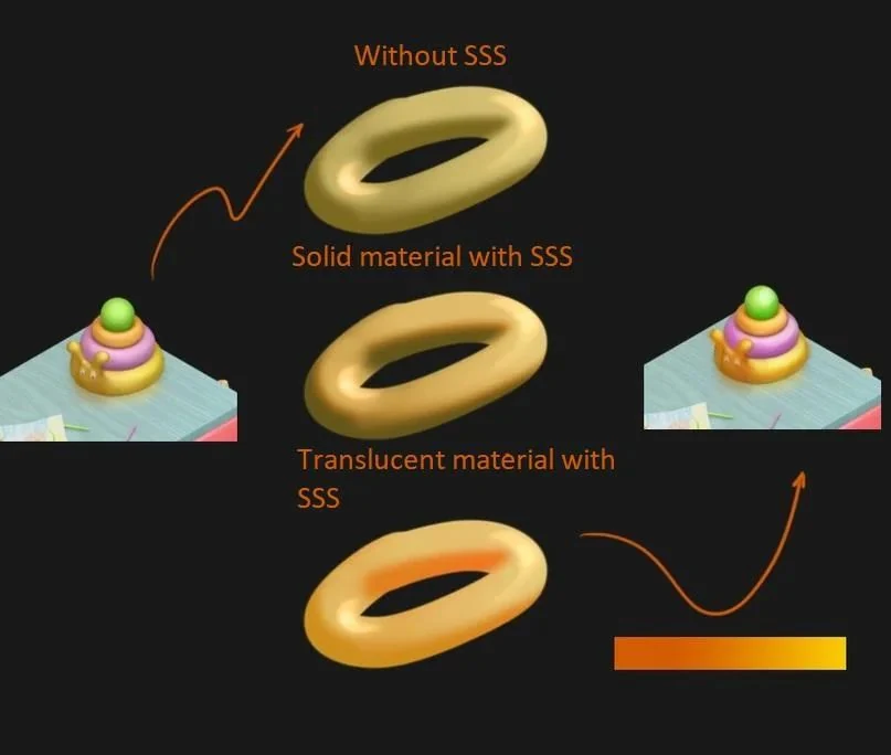
Here we can also see a standard casual technique: to avoid having to use dirty shades of yellow, the color scheme is taken into the orange range, leaving maximum saturation, and adjusting tone through the shade. The connection between light and dark blue works in the same manner.
This work was interesting to dissect. It would be also interesting to take a look at some more complex forms (this is exactly why there is a bee doll on the chair in this test work). It is also nice to see that a 3D model was made, which is a big plus. A little more attention and experience - and everything will be fine.
If you’d like a closer look at how our team approaches this kind of casual prop work end-to-end, see how we handle 2D game art outsourcing, game concept art and full mobile game art design for studios building for the mobile market.
Look for more test task reviews from us in the near future!