
What can be done to make an illustration more expressive?
Hello, everyone! SunStrike Studio creates graphics for mobile and computer games. Below you will find detailed feedback on one of the tasks performed as part of our open test assignment. The author of the work has given us permission to publish this information.
When an illustration is drawn, it always shows a portion of the story. Storytelling is a fairly complex process, so each element of the visual narrative must be related to what is happening in the image. You should start with a simple statement and then supplement as needed.
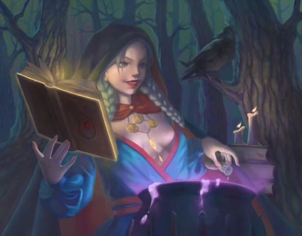
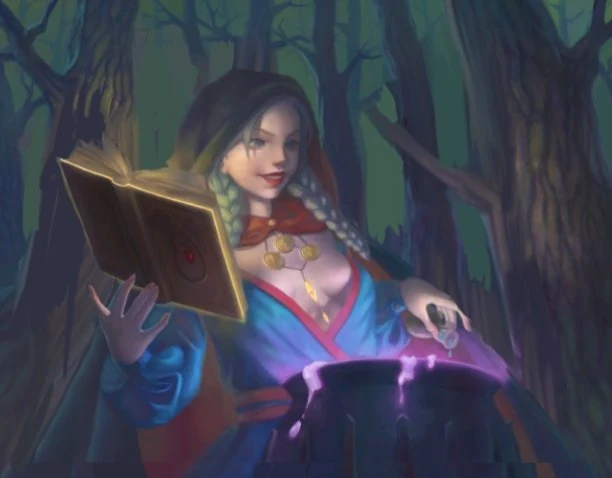
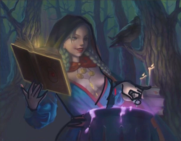
In this example we tell the story of a young witch who performed a minor rite in the woods. This tells us that we need to show the witch, magic, and a forest. The witch is the most important character and should be portrayed in such a way so as to be easily recognizable even by a casual viewer in a small preview.
Distracting scenery should be omitted in order to better complement the image: the stack of books presents an added complication without contributing to the overall story and should therefore be removed. The raven too was not mentioned and should be omitted. The forest behind the heroine needs to be simplified and be given a more generic look. If you are working on this kind of brief and need a partner for 2D game art outsourcing, our team can help take a piece from sketch to finished asset.
“Wishlist” or the reason why the viewer got confused:
Expressiveness
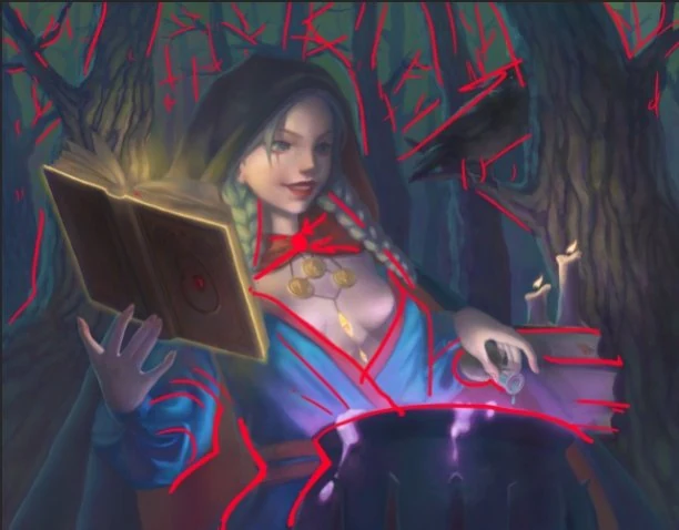
The dynamic pose and active involvement of the character in the plot, layer development - the trees and the character are drawn with the same amount of detail, there is not enough bubbling magic in the cauldron and the overall indication that something magical is happening is missing:
Silhouette
The witch blends in with the background making it difficult to tell where the character ends and the forest begins:
Scale
Compared to the size of the character the trees look fairly small.
Perspective
The cauldron and the character are placed almost on top of each other and the cauldron seems to lean towards the character:
Composition
The objects are all squeezed together. There is not “enough air” or negative space around the character and there are too many objects for this simple plot. The books and the candles should be removed:
Rhythm
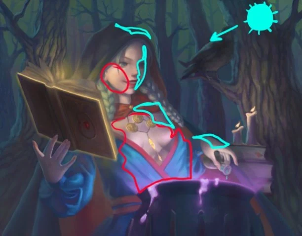
The lines are smooth at the bottom of the image and sharp at the top. The character itself has a chaotic mixture of both:
Lighting
There is a lot of focus on the stomach, chest and right cheek of the character. All of these areas are concentrated in the same portion of the image. It would be much better to divide the highlighted areas into multiple zones, and use the moonlight as part of the composition by letting it shine on the character’s face.
Colors
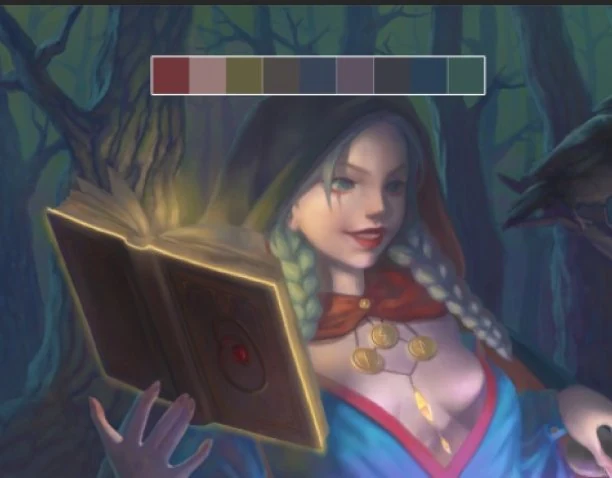
There are not enough clean, vibrant colors:
Anatomy and Costume Design
It would be much better to simplify the outfit, creating a general idea of an attire without being too specific as to what it actually is (for example, by removing the red stripes from the dress so that they do not divert attention and revealing the silhouette of the character by removing the cape). The positioning of the arms and wrists should also be improved. Polished game character art design usually starts from exactly this kind of pass on anatomy and costume:
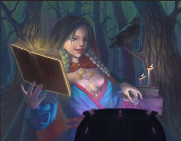
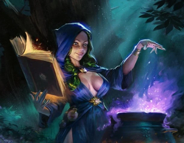
The intent behind these comments is to help make the work truly shine in terms of both story context and the overall impression it leaves on the viewer. Illustrations, and especially ones completed as a test projects, should catch the eye of the potential client and elicit as many emotions as possible. As a result, we get the following illustration:
What Changed?
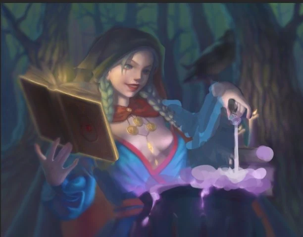
- The character’s arm was raised over the cauldron, the fingers are now spread, and the bottle was removed. An empty opened hand is easier to read than the amount of contents left in a jar.
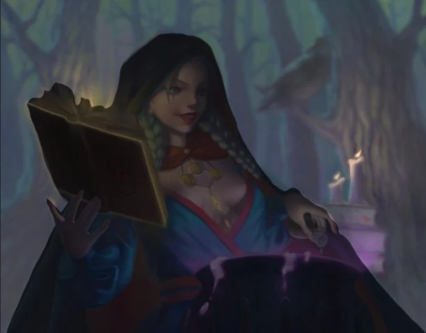
- The character was moved further back from the cauldron to create some distance between them.
- The silhouette of the witch was made more prominent. Her kimono was taken to a seamstress improving its fit, and the cape which previously concealed her shape was removed completely. To make the image even more legible the size of the hood was reduced and gravity was added, making the fabric follow the shape of the character’s head. The hood itself was kept because it creates a negative space between the heroine’s face and the book (two illuminated objects).
- The book was made to look a bit more dynamic: it was left half-open to create a sense of depth for the space and one of the pages was highlighted.
- The character was given more emotions: her eyes glitter, she has a more obvious smile and is looking towards the cauldron.
- The cauldron itself was given more depth, its shape was simplified, and a handle was added to the bottom right corner of the image. The “magic” in the cauldron can and should be augmented to make the image stand out more - let it boil, spill, splash and behave like an awakened force of nature.
- Guide lines were used to shift attention from the center towards the right side, which gave the image movement and a sense of airiness. The center of the composition is quite complex and detailed, which means that the background can be shown as large masses of trees, emphasizing the scale of the forest and making it more evocative.
- The moonlight can be used to illuminate the main elements of the composition, break the scene into planes, indicate the size of the character, and add emphasis to the silhouette.
Having established the foundation we can now shift focus towards the anatomy and the design of the costume. We can add elements of the environment, improve the contrast of the color pallet and continue making sure that the composition remains balanced. For projects that need this level of finishing on backgrounds and props, see our game background design service.
Overall the author of the test project managed to compose a pleasant creative illustration. The point of a test project is to gain confidence that the artist being considered for the role is able to work on a variety of projects and has strong design skills, that would allow this individual to adapt to the daily reality of the studio. In either case, it is very important to be able to approach the work holistically and the author of this seems to be able to do so very well. Studios that build concept art and design day in and day out lean on exactly this kind of holistic critique loop.
Stay tuned for more feedbacks on test assignments!