
What Is Game UI? Meaning, Examples & Design Principles
TL;DR - Key Takeaways
- Game UI = every on-screen element the player sees or interacts with: HUD overlays, menus, popups, dialogue, settings, store, inventory.
- UI ≠ UX ≠ HUD. UI is the visual layer; UX is the felt experience using it; HUD is the live in-game subset of UI.
- Three categories: HUD (during gameplay), menu UI (out of gameplay), diegetic UI (anchored in the game world like Dead Space).
- Mobile UI demands larger tap targets, thumb-zone-aware layouts, and lower information density than PC or console.
- Five principles of good UI: visibility, hierarchy, consistency, feedback, accessibility.
- Production pipeline: style guide → wireframes → mockups → asset production → engine integration → QA.
What Is Game UI?
Game UI is the visual layer the player operates through - the health bar overlaying combat, the main menu before pressing Start, the inventory that pauses the action, the store popup, the settings panel. UI sits over the game world; it is not the world itself. Every shipped game has UI, even the ones that try hardest to hide it.
In practice the term “game UI” covers a long list of components that ship in almost every modern title:
- HUD overlays during gameplay - health, stamina, ammo, minimap, quest tracker, crosshair.
- Main and pause menus - title screen, save/load, level select, options.
- Modal popups - confirmations, achievements, reward unlocks, notifications.
- Inventory and equipment screens - bag, gear, abilities, character sheet.
- Settings and accessibility panels - audio, graphics, controls, colorblind, subtitles.
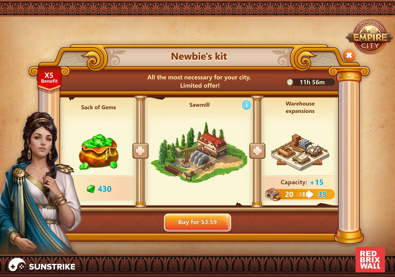
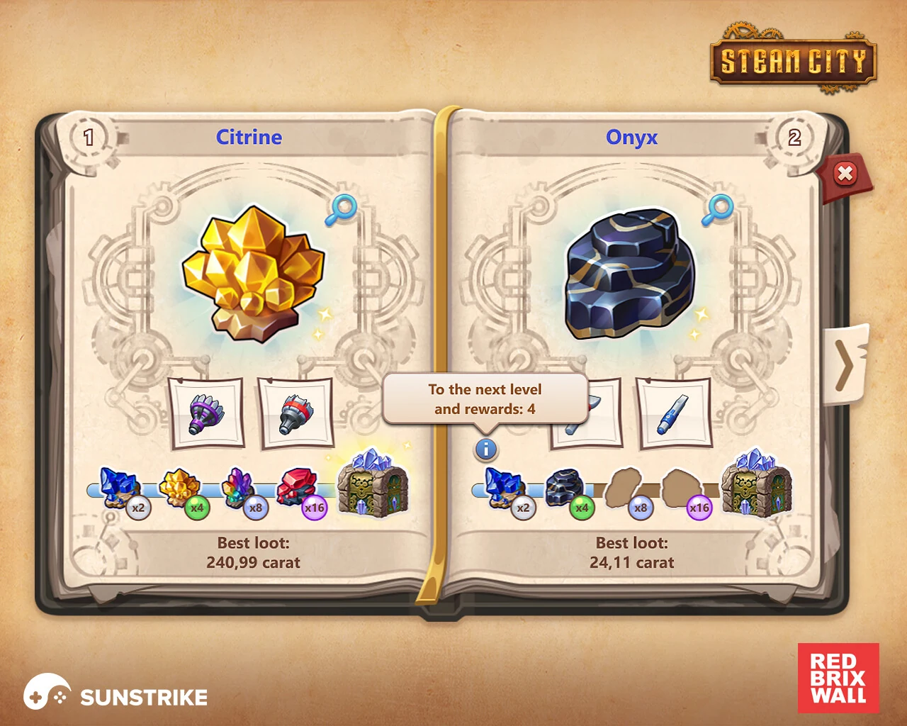
- Store and monetisation surfaces - bundles, currencies, daily deals.
- Dialogue and choice systems - portraits, choice trees, codex.
- Tutorials and onboarding - tooltips, first-time prompts.
- Achievements, leaderboards, social - friend lists, profiles, ranks.
- Login and account flows - sign-in, age gate, parental controls.
Each of those components has its own visual language, animation rules and interaction patterns. A typical AA or AAA project ships hundreds of unique UI screens before the player ever sees the first frame of gameplay.
UI vs UX vs HUD: Quick Disambiguation
UI is the visual interface; UX is the felt experience of using it; HUD is the live in-game subset of UI. Players experience “UI” as the buttons and bars on screen, designers think in “UX” when they shape the flow, and “HUD” is the slice of UI that overlays moment-to-moment gameplay (health, ammo, minimap, crosshair).
| Term | Scope | Example |
|---|---|---|
| UI (User Interface) | Every on-screen element the player operates through | Health bar + main menu + settings panel + store + dialogue boxes |
| UX (User Experience) | The felt experience of navigating that UI | ”It only takes two taps to get from the title screen into a match” |
| HUD (Heads-up Display) | The always-visible overlay during gameplay | Crosshair, ammo counter, minimap, health and stamina bars |
A well-designed game has good UI (clear, on-brand visuals), good UX (efficient, low-friction flows), and a HUD that disappears into the background until the player needs it. Confusing these terms is common in conversation but matters in production - your UX designer wireframes flows, your UI artist creates the visual language, and your HUD designer balances information density against immersion in the live game scene.
Core Game UI Elements
Every shipped game contains a recognisable set of UI components. The naming varies (some studios call menus “screens”, others call popups “modals”), but the categories are stable: in-game HUD, menu UI, popup UI, gameplay-adjacent UI like inventory and dialogue, and meta-game UI like store and achievements.
HUD overlays. Health, stamina, ammo, minimap, quest tracker, crosshair, ability cooldowns. Visible during play, designed to be read at a glance without breaking focus.
Main menu and pause menu. Title screen with new game / continue / settings / quit. Pause screen layered over a frozen game world with resume / restart / options / quit-to-menu options. These are the first impressions and the most-revisited surfaces in any game.
Modal popups. Achievement unlocks, level-up rewards, confirmation dialogs (“Are you sure you want to exit?”), tutorial pop-ins. Each popup interrupts the player, so it must justify the interruption with clear value and a fast dismiss path.
Inventory and equipment screens. Grid of items the player has collected, equipment slots showing what is worn, character sheet with stats. Often the most complex UI in an RPG and the source of most player frustration when designed poorly (tiny icons, unclear sorting, no comparison tooltips).
Settings and accessibility. Audio sliders, graphics presets, control rebinding, colorblind modes, subtitle size, screen shake toggle. The accessibility panel has grown from optional to essential - modern players expect it before they buy.
Store and monetisation surfaces. Featured bundle banners, daily deals, currency packs, season pass page. Touchy UI - the player is being asked for money, so trust and clarity matter more than visual fireworks.
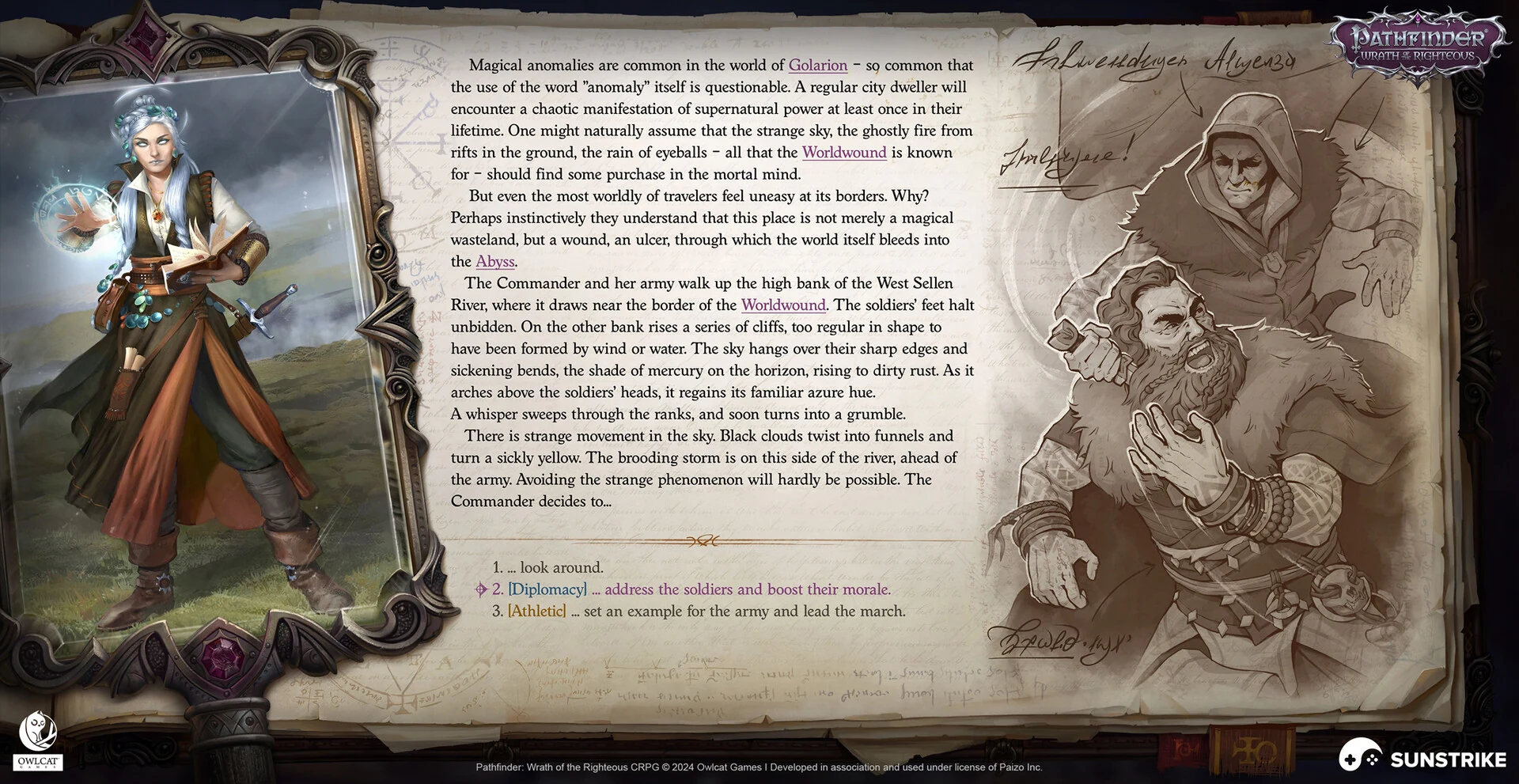
Dialogue and choice systems. Speaker portrait, name plate, text area, choice list with optional skill-check icons (Disco Elysium, Baldur’s Gate 3). Choice UI is the storytelling backbone of narrative games.
Tutorials and onboarding. Inline tooltips, “Press X to crouch” prompts, contextual hints on first encounter with a new mechanic. The tightest UI design budget in the entire game, because tutorials must teach without breaking pacing.
Diegetic vs Non-Diegetic UI
Non-diegetic UI floats over the screen as a separate visual layer. The typical health bar in the corner of the screen, the always-visible minimap, the ammo counter on the HUD - all of these are non-diegetic. They are designed for the player; the character cannot see them. This is the default and most common UI approach.
Diegetic UI lives inside the game world, visible to both the player and the character. Isaac’s health bar is built into the spine of his suit in Dead Space. Far Cry 2 makes the player pull out a physical paper map to navigate. Metro Exodus shows status indicators on the protagonist’s wristwatch. The Metroid Prime visor overlays interface graphics on the inside of Samus’s helmet.
The classic four-category framework from the Fagerholt and Lorentzon thesis on game UI distinguishes four positions an interface element can take:
- Non-diegetic - exists for the player only, drawn over the world (most HUDs).
- Diegetic - exists in the game world for both player and character (Dead Space, Far Cry 2).
- Spatial - positioned in 3D space but not part of the fiction (floating waypoint markers, ground-projected aim indicators).
- Meta - lives in the fiction but acknowledges the player (screen edges turning red on damage, controller rumble).
Most modern games mix all four. A spatial waypoint guides the player to the next objective, a non-diegetic ammo counter sits in the corner, a meta blood-splatter overlay covers the screen on low health, and a diegetic interaction prompt appears on a door in the world. Designing each layer separately and then making them coexist is the heart of game UI work.
Game UI by Genre
Genre shapes UI more than any other variable. A great battle royale UI would be terrible in a turn-based RPG. Each genre brings a different combination of information density, screen real estate, input precision and pacing.
FPS and TPS. Speed-first UI. Crosshair, ammo, health, minimap - all in fixed corner positions for instant glance reading. Minimal information density, maximal contrast, no nested menus during play. Examples: Call of Duty, Apex Legends, Doom Eternal.
RPG and open-world. Heavy information load - inventory, quest log, map, dialogue, abilities, stats. Layered behind menus that pause or slow the game. Comparison tooltips, sorting, and search are core UX features, not nice-to-haves. Examples: The Witcher 3, Baldur’s Gate 3, Elden Ring.
Mobile casual and match-3. Big buttons, low cognitive load, animations that celebrate every match. Energy timers and “free chest” prompts dominate the meta-game UI. Lives and stamina systems gate progression. Examples: Royal Match, Homescapes, Candy Crush.
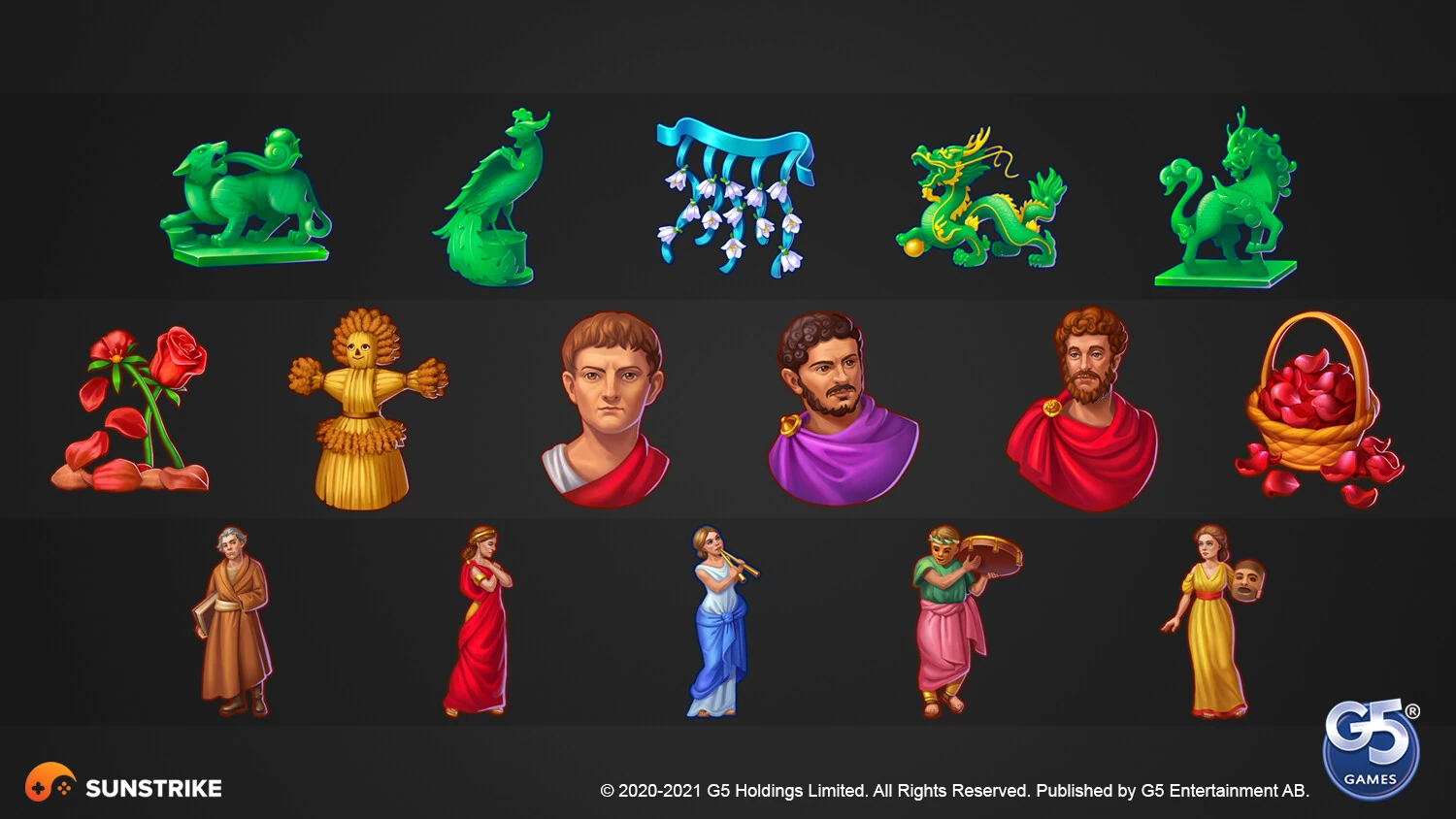
Slot and casino. UI tightly coupled to the game scene - spin button dominates the lower screen, paytable accessible by tap, bonus celebrations are full-screen takeovers. Trust signals (RTP%, fair-play badges) are usually surfaced in the settings panel. Examples: Jewels of Egypt-style match-3 hybrids, classic slot reels with bonus games. SunStrike has shipped UI for dozens of slot and casino titles - the UI rules in this genre are tighter than anywhere else.
MOBA and strategy. Information-dense by design. Hero portraits, ability bars, gold, levels, minimap, teammate health, item shop - all simultaneously visible. Players expect to read multiple panels in parallel. Examples: League of Legends, Dota 2, StarCraft II.
Idle and incremental. Numbers, lots of numbers. Big readable counters, prestige resets, upgrade trees, offline-progress popups. UI is the game in these titles. Examples: Cookie Clicker, AdVenture Capitalist.
Battle royale. Hybrid of FPS speed and RPG inventory. Zone timers, squad health, loot tier indicators, ping system - all live on the HUD. Inventory screens are streamlined to avoid pausing play. Examples: Fortnite, Apex Legends, PUBG. We covered the genre’s UI design considerations more deeply in our HUD design guide.
Narrative and adventure. Dialogue UI dominates. Choice systems, codex, journal, relationship trackers. Combat is rare or absent, so HUD is minimal or completely diegetic. Examples: Disco Elysium, What Remains of Edith Finch, Pentiment.
Iconic Game UI Examples
Five game UIs get cited repeatedly in design talks because each solves a different production problem with style. Persona 5 turns navigation into theatre. Hades II locks aesthetic to fiction. Dead Cells proves pixel-art UI can be readable. Cyberpunk 2077 dissolves UI into the world. Honkai: Star Rail handles extreme density without losing the player. Each is a reference worth studying.
Persona 5
The most-referenced UI in the past decade. Vivid red, black and white. Dynamic, off-kilter menu compositions that animate as you navigate. Every icon, button and transition reinforces the game’s “stylish rebellion” theme. The menu system uses motion as personality - even something as mundane as opening the inventory feels cinematic. Persona 5 proved that UI is brand, not just plumbing.
Hades II
Supergiant’s follow-up extends the original Hades UI vocabulary - hand-drawn portraits, ornate frames, runic motifs, generous use of warm golds and deep reds. Boon screens use bold typography and clear hierarchy so players can scan three options under combat pressure. The pause and meta-progression screens hold their own as illustrated artwork. Hades II is a masterclass in matching UI aesthetic to game world fiction.
Dead Cells
Pixel-art UI in a 2D action-roguelite. Minimal HUD - health and weapon icons in corners, currency in the top bar, nothing else during play. Inventory and shop screens use a generous grid of crisp pixel-art item icons. The challenge in pixel-art UI is readability at scale; Dead Cells solves it with strong silhouettes and high-contrast palettes.
Cyberpunk 2077
Heavily diegetic UI. The phone interface is rendered as a holographic overlay the character actually uses. The inventory screen styles itself as the in-world “ripperdoc cyberware” software. Even the main menu sits inside a fictional Arasaka Corporation product. Cyberpunk is the modern reference for “UI as worldbuilding”.
Honkai: Star Rail
Stylised anime UI with extreme density. Character profiles, gacha banners, daily missions, simulated universe, four currencies, three combat sub-systems - all surfaced through hierarchical menus that use cards, tabs and modal overlays. Star Rail shows what modern free-to-play mobile/PC UI looks like when every retention mechanic is wired into the screen.
Mobile Game UI: Touch, Thumb Zones & Smaller Screens
Mobile UI is the hardest game UI to design well. The screen is small (6-7 inches diagonal), held in two hands with thumbs as the only input, and the user is often interrupted by notifications, calls and other apps. None of those constraints apply on PC or console.
Tap targets. Apple’s Human Interface Guidelines set the minimum tap target at 44 × 44 points; Android Material Design says 48dp. Below that, players miss touches and frustration spikes. Game UI typically pushes tap targets larger (60-80px) because gameplay rarely allows the precision of a calmly-used calendar app.
Thumb zones. When a player holds a phone in both hands, only the lower-third of the screen is comfortably reachable by both thumbs without re-gripping. The top-right corner is the hardest to reach (impossible one-handed without stretching). Action buttons go in the lower half. Inventory and pause controls go in the top-right specifically because the player should not press them by accident.
Portrait vs landscape. Casual mobile games default to portrait because that is how people hold phones outside of dedicated gaming sessions. Action games default to landscape because they need horizontal space. Each orientation has its own UI conventions and the game must choose one - very few games support both well.
Information density. Mobile UI carries roughly 50-60% of the information density of console UI on the same screen-fraction. Players are reading at arm’s length on a small panel, often with one eye on real-world surroundings. Big numbers, few icons, generous spacing.
Notch and bezel awareness. Modern phones have notches, camera cutouts, and rounded corners. Safe-area insets must be respected or UI elements get cropped. Test on a real iPhone with a Dynamic Island and a real Samsung with a centred camera hole.
Principles of Good Game UI
Good game UI follows five principles that hold across every genre and platform: visibility (critical information stays readable at a glance), hierarchy (the most important element wins the most pixels), consistency (one visual language across all screens), feedback (every input gets a response within one frame), and accessibility (colorblind, scale, contrast and remapping options). Most of these come from general usability theory adapted to interactive entertainment.
1. Visibility. Critical information must be visible at a glance. Nielsen Norman Group’s first usability heuristic applies directly: keep the system status visible. In games this means health, ammo, current objective and player position should always be readable without diving into a menu.
2. Hierarchy. Not everything is equally important. A health bar at 5% should dominate the screen with size, colour and motion; an idle currency counter should be a quiet number in the corner. UI hierarchy is what separates information from noise.
3. Consistency. A button that looks one way on the menu should not look completely different in the store. Players learn the visual language of your game in the first ten minutes; every breach of that language costs cognitive energy. Build a UI style guide early and enforce it ruthlessly.
4. Feedback. Every player input deserves an immediate visual or audio response. Click a button and it should depress, glow, animate, or play a sound within 16ms (one frame at 60fps). Without feedback the player wonders if the input registered, and they will mash it again.
5. Accessibility. Colorblind modes, scalable text, configurable contrast, subtitle options, remappable controls, screen-shake and motion-blur toggles. The W3C Web Content Accessibility Guidelines are the cross-medium reference; modern game accessibility has converged on a similar set of options pioneered by Naughty Dog’s The Last of Us Part II and now considered baseline by most major studios.
The Game UI Production Pipeline
A typical game UI deliverable - from “we need a new inventory screen” to “ready in engine” - moves through six gates. Each gate exists to catch problems before they get expensive.
1. Style guide. Before any UI screen is designed, the studio agrees on the visual language: colours, typography, button shapes, animation timing, icon style, layout grid. The style guide is a single source of truth that every UI artist references. Without it, the first menu and the fiftieth menu end up looking like they came from different games.
2. Wireframes. Low-fidelity layouts in black and white that focus on information hierarchy and flow - “the health bar is here, the minimap is here, the pause menu opens from here”. Wireframes are cheap to change. Most UI mistakes are caught at this stage.
3. Mockups. High-fidelity visual designs of the wireframed screen. Real typography, real colours, real iconography. Mockups are reviewed alongside the rest of the art team to make sure the UI lives inside the same world as the characters and environments.
4. Asset production. Final-quality export of every individual UI element: icons, buttons, frames, backgrounds, animations. Exported at the right resolution and packaged for the target engine. This is where most UI outsourcing engagements actually deliver value - a specialised partner can produce hundreds of clean assets faster than an in-house art team that is also handling characters and environments.
5. Engine integration. UI assets get wired into Unity/Unreal or a proprietary engine. Animations get timing, buttons get hover and pressed states, layouts get responsive rules for different screen sizes. The UI engineer or technical artist on the team owns this stage.
6. QA. Visual QA on real devices (every aspect ratio, every locale, every accessibility option), input QA (controller, keyboard, touch, all combinations), and performance QA (frame-rate impact, memory budget). The bug list from this stage feeds back into all five earlier gates.
Common Mistakes in Game UI
Patterns that come up in almost every project review:
- Tiny icons in inventory grids. What looks fine in the designer’s 4K mockup becomes unreadable on a 6-inch phone. Test on the target device early.
- Inconsistent button states. Hover, pressed and disabled states drift across screens because no one centralised them in a component library. Build the component library first.
- Hidden critical info. Players have died because their low-health warning was the same colour as the background. Health and ammo deserve maximum contrast.
- Modal popup overload. Three popups stacked when the player levels up at the end of a mission. Each one was justified individually; together they ruin the moment.
- Tutorial text that cannot be skipped. Veteran players resent forced onboarding. Always provide a skip option after the first paragraph.
- No localisation budget in text fields. German is 40% longer than English; Japanese is 50% shorter. A button that fits English breaks in German. Design with 1.5x the worst-case text length as a buffer.
- Mobile UI that does not respect safe areas. UI gets cropped by the notch on iPhone or the cutout on Samsung. Use safe-area insets, not screen edges.
When to Hire a Game UI Studio
In-house UI design works when the project is small enough to be carried by one or two artists who also handle the rest of the art. Past a certain scale - usually around the time you need a full menu system, a store, a tutorial flow and twenty distinct popups - you have a choice between hiring an in-house UI team or working with a specialist studio.
A UI-capable outsourcing studio brings:
- UI and UX designers who can wireframe, mockup and prototype.
- Illustrators and icon artists for the asset volume.
- Animators for transitions, button feedback and reward celebrations.
- Engine integrators (Unity, Unreal) who can wire assets into the live build.
- QA artists who test on real devices across locales and accessibility modes.
The fit is best when you need elastic capacity - a content patch, a new game mode, a seasonal store refresh, a console port that needs controller-friendly UI on top of an existing mobile version. SunStrike’s icon and UI team handles icon design, illustration, menu art and full UI/UX flows; for character-heavy games we pair UI work with 2D character art and 3D character design services so the entire visual surface stays coherent. Deeper context on production decisions lives in our game art visual direction guide, and our HUD design guide covers the live-overlay side of UI in detail.
If you are planning a new title or a UI refresh for an existing one, get in touch - we will scope it together against your platform, genre and timeline.