About the Magic School UI set
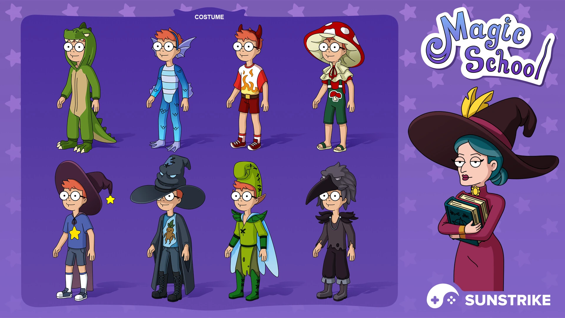
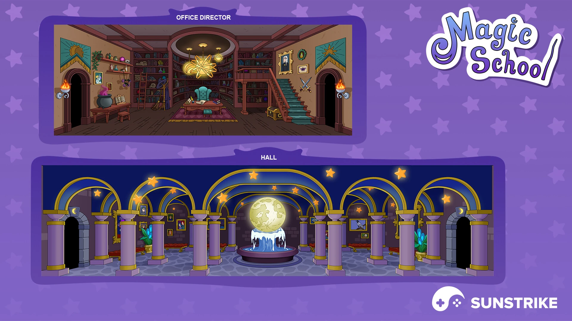
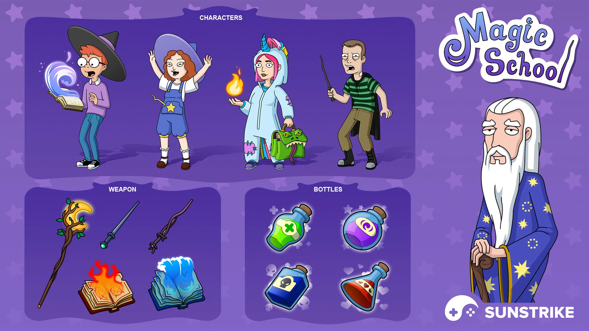
The three frames cover an interface layout sheet, an icon family with themed magic-school props, and a UX flow snapshot showing how panels stack inside the runtime layout. The cover frame leads with the layered UI screen at full render size to anchor the SKU identity.
Icon silhouettes were tuned for visual hierarchy so primary action icons read louder than secondary trim during gameplay, and the panel ornament keeps enough negative space around the action area for clean tap-target readability.