
Painting Lifelike Foliage for Game Art: An Extended Guide
Foliage is where worlds feel alive. A well-rendered tree can carry an entire composition, whereas a flat, repetitive shrub can bring it down. Leaves complicate light and color in ways hard-surface objects don’t: they transmit light, they scatter it, they clump into irregular masses that change character with distance and season. Yet once you approach them with the right mindset - volume-first, color-intentional, and rhythm-aware - foliage becomes one of the most rewarding subjects in environmental art.
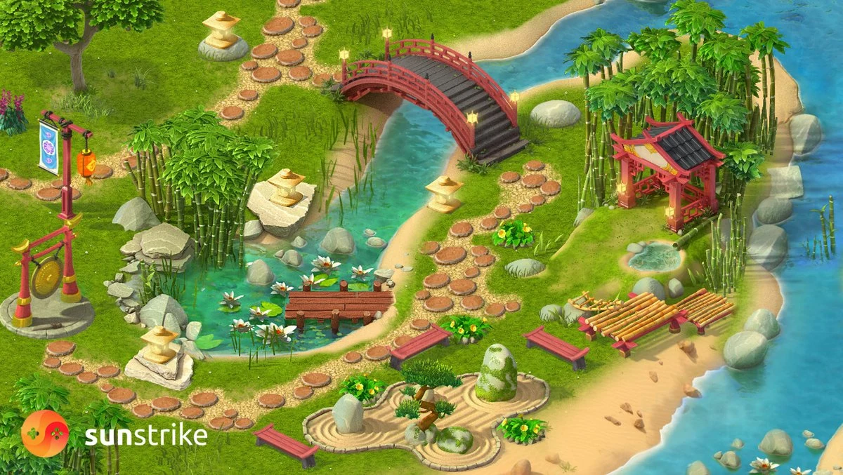
At SunStrike Studios, we design, paint, and ship foliage-heavy scenes across genres and platforms. This expanded guide translates hard-won studio practice into a clear, artist-friendly process. We’ll start with the ideas that matter and flow into an end-to-end workflow you can recreate on your next painting or production task. If you need a partner for game background design, our environment team plugs in at any stage.
Start with the right mental model
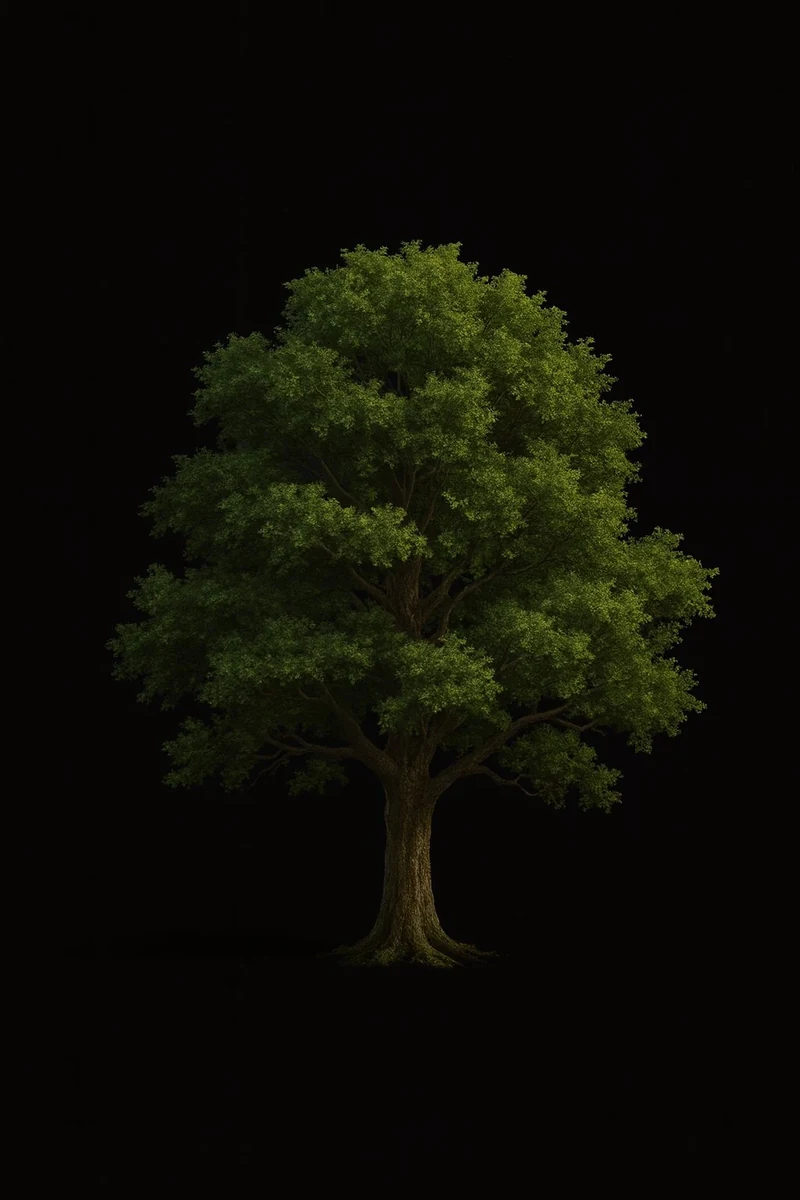
A leaf is more than a flat sticker you paste onto a canopy. Treat each leaf as a small three-dimensional form with a broad face and a thin edge; that edge catches light, and the face turns in space. When you remember “leaf = mass with planes,” you naturally paint clusters that feel volumetric instead of papery.
There’s a second trap: identical orientation. Real foliage is a chorus of tilts and twists - some leaves turn toward you, others away, many sit at edge-on angles that reduce their apparent surface. Add the forces that bend them: branch direction, gravity, wind - and you understand why canopies painted with every leaf facing the viewer never look right. Vary orientation early, even in your thumbnail.
Finally, abandon the idea of “one green.” Even a single leaf slides through warm and cool temperatures as it moves from light into shade; veins and tips often shift hue; different leaf ages push toward lemon or olive; and the environment - sky, soil, nearby buildings - tints everything. When you plan a palette, build distinct bands for sunlit greens, cool shadow greens, and translucent glow.
Think in masses before details
Great foliage painters don’t chase single leaves; they sculpt clusters. Visualize the canopy as a set of basic forms: spheres, cones, and ellipsoids, each defined by a distinct lit side and a shadowed side. Those big shapes define the read at a glance. Only after that do you break the volumes into secondary lobes, then smaller clumps, then a few leaf edges in focal areas. This mass-first approach keeps your image legible while giving you a place to invest detail intentionally.
Distance guides your detailed budget. Close to the camera, leaves read with sharp edges and strong contrast; in the midrange, detail fuses into broader texture, and farther out it simplifies into tonal masses and silhouette under atmospheric perspective. Pick a couple of focal clusters for micro-detail and let the rest breathe.
Rhythm ties it all together. Vary cluster sizes, large, medium, and small and space them unevenly to avoid a manicured hedge-trimmer silhouette and rigid, straight-line branch patterns. Different species set their own cadence: willows cascade, oaks fan outward, conifers stack in tiers, so study the growth habit and amplify it to give your tree a lyrical rhythm.
Move from general to specific. Establish the silhouette and global light first, then the secondary lobes, then the tertiary clusters, then a handful of hero leaves. This protects you from over-rendering unimportant areas and locks the composition before the fun detail work begins.
Color, light, and the poetry of thin materials
Leaves are thin, semi-translucent materials. Light sneaks through them and blooms, especially along edges and tips, creating tiny halos of saturated, warm color where the sun passes through. Save your most vivid greens for the translucent glow, and paint broad sunlit planes lighter but with reduced saturation, since strong light tends to wash color out. Shadows, meanwhile, are rarely neutral gray; in open shade they skew cooler and richer because they borrow color from the sky.
Different times of day recast foliage entirely:
- Midday: High contrast with chalky lights and cooler shadows. Collapse your midtones a bit; make small highlights tight and bright.
- Golden hour: Warm backlight turns leaf edges into glowing filigree. Interiors stay comparatively cool.
- Overcast: Contrast softens. Use temperature, not value, shifts to describe form.
- Forest interior: Cool ambient dominates; bounce from trunks and soil adds earthy shifts.
- Night with artificial light: Warm pools of light against cool moonlit masses; speculars get sharper on waxy leaves.
Treat these scenarios like mini color scripts. Before you commit to the final, paint quick, tiny keys to decide your hue relationships. They cost minutes and save hours.

Edges that breathe
Edges carry your viewer’s eye. On the lit side of the canopy, make some contours surprisingly hard where clusters overlap; leave others soft or broken into sky holes. In deep shadow, lose edges entirely and let forms melt together. Inside the canopy, reserve razor-sharp leaf rims for focal zones; elsewhere, paint hint-marks, staccato brush touches that imply serration without copying a brush stamp a hundred times.
A trick for lively edges: let a few single leaves escape the silhouette - one sprig poking into the sky, one leaf falling. These small disruptions sell scale and motion.
Brushwork without the “stamp look”
Textured foliage brushes are powerful, but overuse can reveal your tool instead of your intention. Build the painting in a hybrid way:
- Block in with simple brushes - hard round, soft round, chalk, to nail volumes, gradients, and light direction.
- Introduce a textured speckle or scatter brush to suggest leaf noise sparingly. Vary size, angle, and spacing; don’t let a repeated stamp pattern telegraph itself.
- Return to simple brushes to carve a few hero leaves with crisp control.
- Finish by using a bristle or rake brush to lay in targeted, directional highlights on glossy-leaf species (like magnolia) and break up visual monotony.
If you prefer to start with a textured block, balance it with counter-movements: add a few passes of a clean flat brush into focal areas to make them look intended rather than auto-generated.
A practical, repeatable workflow
Intent and references. Write one sentence that defines your goal (“A windswept pine under warm backlight; drama at the rim”). Gather species-accurate references: different angles, times of day, and seasons. Sort them into structure (branching, leaf shape), materials (surface quality, thickness), and lighting (keys for sun, shade, backlight).
Silhouette and big light. Fill the main canopy shape with a single value; carve secondary lobes to avoid a balloon outline. Decide light direction. Paint a clean separation between light and shadow across the entire form.
Value grouping and palette. Choose three value families: light, halftone, shadow. Choose a warm tone for sunlight, a cool tone for shadows, and a richly saturated tone for translucent effects. Use moderation; more isn’t always better.
Cluster design. Place tertiary clusters where the form turns; puncture the silhouette with irregular voids. As you place the clusters, follow the species’ natural cadence so the canopy reads with a smooth, flowing motion.
Focal detail. Select two or three clusters to carry crisp edges, cast shadows, and color accents. Everywhere else, keep brushwork broader.
Unify and balance. Use subtle warm/cool glazes to pull regions together; sharpen a couple of edges and bury a few more. Zoom out often; the tree must read at thumbnail size.
Polish. Remove repetitive patterns. Tweak saturation hierarchy. Add story: a snapped twig, a bird, drifting pollen. Stop before every leaf is equally important.
Composition: make foliage serve the scene
Foliage isn’t just an object; it’s a compositional device.
- Use canopies to frame focal subjects, creating a negative-space window around characters or structures.
- Guide the viewer’s gaze with branch gesture - tilt a limb toward the focal point and curve a vine to mirror the scene’s motion.
- Control complexity. Cluster noise near your focal area and simplify elsewhere so players know where to look.
- Exploit depth. Layer trees like stage sets: foreground silhouettes soft and dark, midground with moderate detail, background as haze and shape.
In background painting for sidescrollers and top-down games, foliage doubles as level design language. Clear silhouettes and value grouping help players parse walkable space versus decoration; vivid leaf clusters can mark points of interest without needing UI. For studios building 2D environments at scale, that compositional discipline is what keeps levels both pretty and playable.
Species-aware decisions
Not all trees tell the same story. A cypress clings to wind-carved forms; a birch reads as fluttery stacks of coin-shaped leaves; a eucalyptus presents long, matte leaves with dusty blues. Spend a few minutes learning how your species grows and how its leaves attach to the branch - alternating, opposite, whorled. That single bit of homework transforms a generic canopy into a believable character.
Season matters too. Spring greens are light and lemony; mature summer foliage is richer and calmer; drought or late season introduces olive, umber, and rust. Limit your palette per scene to that seasonal story for cohesion.
Lighting craft: where realism and style meet
If you aim for realism, let physics guide you:
- Through subsurface scattering, light filtering through thin leaves turns warmer and more saturated. Reserve small zones of intense chroma at edges and thin parts.
- Multiple ambient sources: Sky cools shadows; ground warms undersides with brown or ochre bounce; nearby surfaces add tints (a red roof, a blue wall).
- Occlusion: Deep canopy interiors go darker and less saturated; their edges feather into the light with small, lacey shapes.
If your project is stylized, abstract these behaviors without discarding them. You might compress values and exaggerate temperature contrast, or outline the canopy with clean graphic shapes while keeping a whisper of translucent glow to suggest thinness. Style isn’t a license to ignore light; it’s permission to decide which truths to keep.
Common problems and elegant fixes
”Everything is equally detailed.”
You’re painting bravely but not directing. Pick a hero cluster and demote others. Unify the secondary passages with soft glazes so their edges melt away, then invest the saved time into a standout leaf overlap.
”Silhouette looks like a perfect balloon.”
You’re missing secondary lobes. Carve a few purposeful notches into the silhouette and string irregular small clumps along the edge. One protruding twig and one deep negative-space indentation can break the plastic instantly.
”It still looks like flat stickers.”
You’ve got a face-on leaves only. Add edge-on leaves and view changes; paint the underside of a few leaves cooler and darker; allow tilt and overlap to create tiny cast shadows.
”Shadows are dead or black.”
Inject sky color and bounce. Lift the value slightly and add a cooler hue. Next, let a few shadows lightly meet the leaf edges, forming crisp, slender contact lines.
”It’s green soup.”
You’ve lost hierarchy. Re-state three value families; cap saturation on the sunlit faces; reserve juicy greens for translucent rim moments.
”The brush texture is visible as a pattern.”
Rotate and scale stamps; repaint edges by hand; overlay a different texture at low opacity to break repetition. Better yet, paint most of the form with simple brushes and only season with texture.
Practice routines that move the needle
Set aside one hour, twice a week.
- Do six thumbnails of different tree silhouettes, 5 minutes each, one value only. Focus on big lobes and rhythm.
- Paint four tiny color keys of the same canopy under different light: midday, golden hour, overcast, night.
- Choose a species and draw a page of leaf orientations - front, edge, underside - paying attention to foreshortening.
- Finish with a single focal cluster study: five crisp leaves, a couple of cast shadows, and a translucent highlight.
- You’ll build instincts faster than hunting one perfect brush.
Bringing 2D principles into production and 3D
Even if you’re painting 2D key art, think like production:
- Level of detail: Anticipate where the asset will sit on screen. Handheld mobile? Then cluster readability and clean silhouettes matter more than fine vein texture.
- Texture economy: If you’re also creating game assets, keep a small leaf atlas with variations (young/old, small/large) for mixing without repetition.
- Card placement (for billboard or shell techniques): Follow real branching angles; avoid donut rings of leaf cards; stagger densities.
- Normals and translucency: In a 3D pipeline, a touch of two-sided lighting or transmissive shading goes a long way; make sure hero assets get that love, and background trees keep it cheaper.
- LOD thinking: At distance, prune detail and collapse shapes - your concept should predict that simplification so the look stays consistent.
These considerations keep your concept, marketing art, and in engine assets speaking the same language. Teams shipping at scale often pair concept with in-engine 3D production so the painted look survives translation into engine.

A full walkthrough you can follow today
Imagine you’re tasked with painting a windswept coastal pine for a key splash screen.
Begin with intent: a resilient tree leaning into ocean gusts, warm late-daylight. Draw three silhouette options and choose the one with the strongest gesture. Fill it with a mid-value and sweep a light direction from upper left. Carve the canopy into three primary lobes: top crown, windward extension, leeward pocket, so the silhouette breathes.
Glaze warmth onto the light side and a cooler teal into the shadows. Introduce a saturated reddish-orange for translucent accents; test it on a small edge cluster. Now design tertiary clumps where the form turns. Break the windward silhouette with irregular sky holes, then place two focal clusters: one on the glowing rim, one where a branch intersects the trunk.
Switch to a crisp brush and sculpt a handful of hero leaves in those zones. Paint thin cast shadows that kiss neighboring edges; pop a few highlights where waxy needles catch the sun. Everywhere else, keep brushwork broad. Add a twisting, wind-bent branch reaching into negative space, and a single leaf drifting away to suggest motion. Finish with a warm/cool grade to harmonize the piece. Step back; does the tree read at thumbnail size? If yes, you’ve won.
How SunStrike Studios can help
Whether you need a painterly forest for a narrative adventure, stylized jungle icons for a casual mobile hit, or grounded marketing art for your Steam page, SunStrike Studios can plug into your pipeline exactly where you need us. Our environment artists build believable foliage from silhouette to final polish, and our QA team catches repetition, value drift, and lighting conflicts before they reach your players. For mobile teams in particular, our mobile game art design crew tunes leaf clusters and silhouettes specifically for small-screen readability.
If your next milestone includes nature, forests, gardens, overgrown ruins, let’s make it memorable.
Credits and further reading
This article builds on widely taught foliage principles - seeing leaves as three-dimensional forms, varying orientation, using nuanced color, thinking in masses first, scaling detail with distance, preserving rhythmic shape design, and moving from general to specific - ideas you’ll also find in many foliage guides we recommend exploring.