
Game Art
Outsourcing Studio
Working on composition in illustrations
Working on composition in illustrations
Hello, everyone! SunStrike Studio creates graphics for mobile and computer games. Below you will find detailed feedback on one of the tasks performed as part of our open test assignment. The author of the work has given us permission to publish this information.
Art of the Artis tIvan Shinkevich
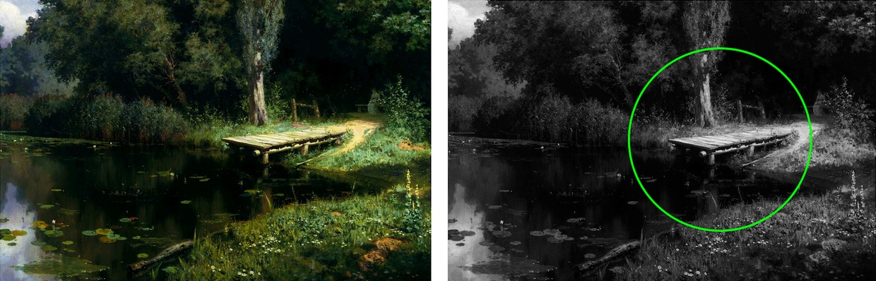
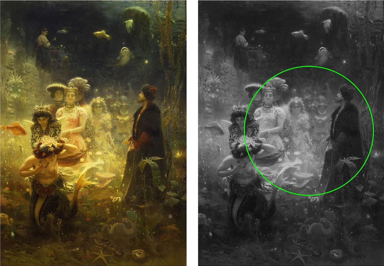
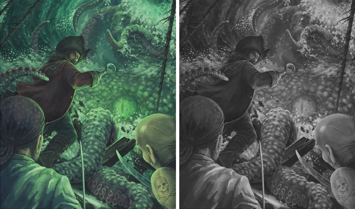
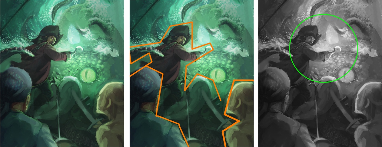
Tone. The main goal of the illustration is to direct the viewer’s gaze towards a specific point, the center of the composition. This includes working with tonal contrasts. If we take a look at the works of masters created with a fairly tight color pallet in black and white, we will see that the center of the composition has a focal point that uses brighter, more contrasting colors. The further away from the center of the composition, the less contrasting the tone will be.
The test task illustration has all of the tones jumbled together. If you switch the picture to black and white, you will see that the composition does not have a defined center. The tonal blocks are not subdivided, which prevents the audience from focusing on the important part.
Below is an example of how you could group the sections by tone and highlight the center of the composition:

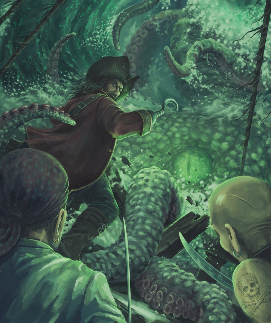
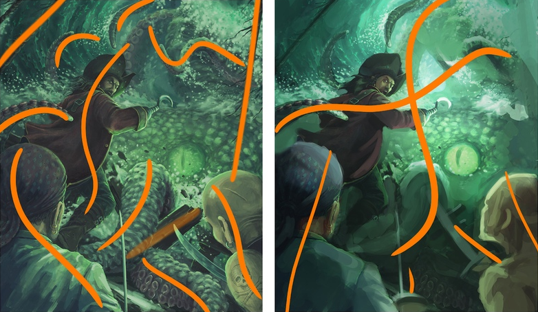
Composition. The composition is also affected by lines. They direct the viewer's gaze towards the main object in the image. Overall, this picture does a fairly good job of using guiding lines. But because of their number, and the fact that they are fragmented by tone, the audience will have a bit of trouble comprehending the image. There are too many visible tentacles. You can safely remove 2-3 of them or differentiate them by using contrast. In terms of composition, it would be better if the pirate on the right side was looking at the captain instead of his own feet. Especially since it is clear that the captain is trying to motivate his crew to fight a battle:
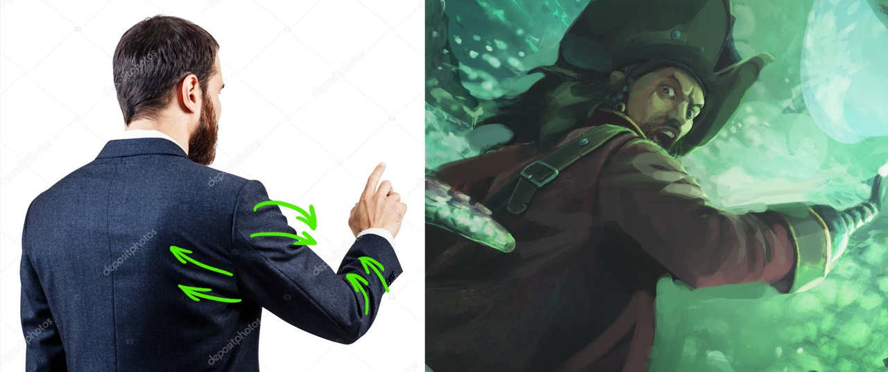
The composition usually does not work well when straight contrasting objects are “stuck” into the character (see picture on the left). It is best to avoid doing so. Also, it is not a good idea to cut off the head and the shoulder in the forefront of the image and let the sabre stick out from the body. It would work much better if more of the body was shown and the left shoulder was moved a bit further back. In this pose the right hand with the sabre would be sticking out forward. Along with the sabre, you can show a bit of the wrist:
Anatomy. If the illustration uses complex angles, make sure to study the references of the figure and skull before you begin. This will help determine where the zygomatic bone should be, how the jaw will protrude, at what angle the nose will be positioned, and how the perspective will distort thirds of the face. The captains character illustrates this well - the proportions of the face are incorrect and it does not obey the perspective it is displayed in. The nose is too long, the jaw has to protrude forward. Eyebrows are curved very unnaturally. It would work much better if they were displayed a bit simpler:
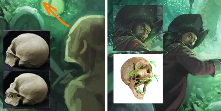
Take some time to study the facial muscles:
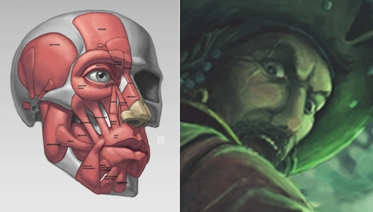
Here we can see that the nasolabial fold is very exaggerated and looks more like a large muscle, which does not actually exist. It weights down the nose of the character.
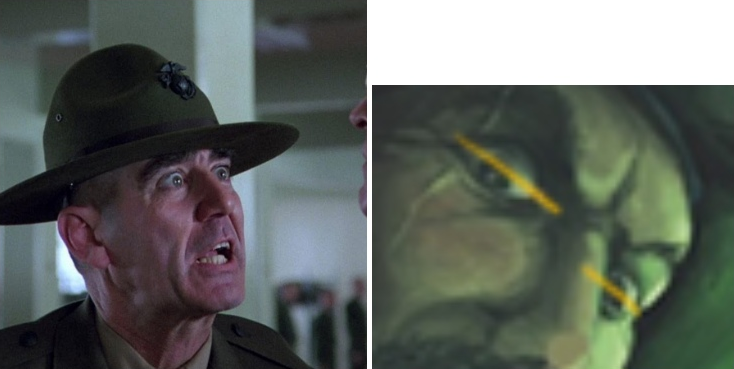
You should also make sure to check the facial features as they related to the axis line. The eyes are noticeably at different levels. The shoulder should be made a bit longer.
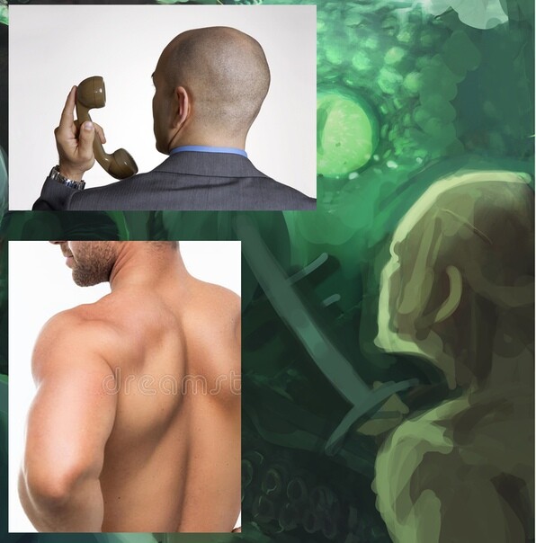
The pose of the pirate on the right should be made to look more dynamic. References will once again help us here. It would be best to redo the whole composition by showing more of the body and “unsticking” the head from the edge of the sheet.
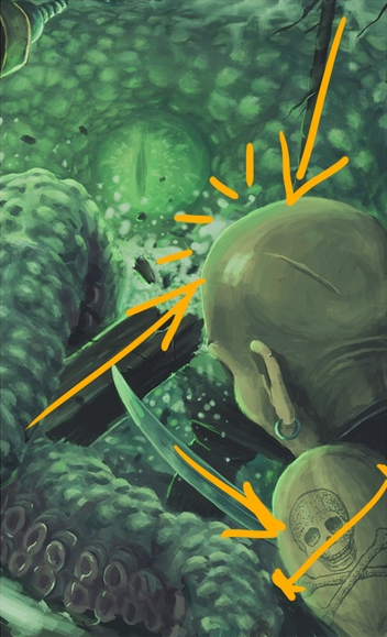
Folds. The perspective on the folds on the back of the trench coat is distorted, which makes the left side of the coat look shorter than the right one. The folds are overall too small, frequent and monotonous in their rhythm. Pay attention to this and study reference materials. The thickness of the fabric will also have an effect on how the folds look:
The only way the folds on the shoulders of the left pirate would look like that would be if he grabbed his shirt in the middle on the front and pulled it downward. It would work much better if they were simplified as well. The folds on the sleeve look overall good, but should be more carefully drawn, instead of using such rough brushstrokes to show volume. Taking a look at the folds and scratches on the head of the right pirate, we should keep in mind that skinfolds and scratches on the body have different properties than folds and scratches on other objects. Here too we need to study the references:
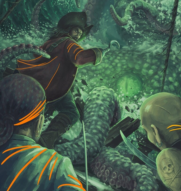
Material Render. So far, all the materials in the illustration have been drawn in the same manner using rough brushstrokes. In reality, each type of material will have its own physical properties. How do they reflect light? What creates a glare? Each material has its own texture. For example, the tentacles of the octopus will be slimy and shiny. The metal will have many contrasting reflections. Skin will have different shades in middle tones and in the shadows when illuminated with a cold light source. If the skin and hair are wet, they will reflect the sky more.
Before staring a large project you should spend some time studying the different materials and putting together a mood board:
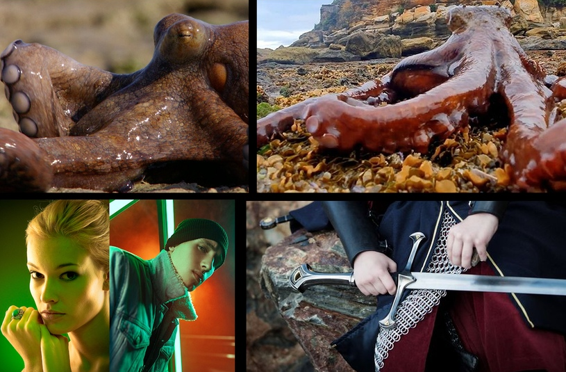
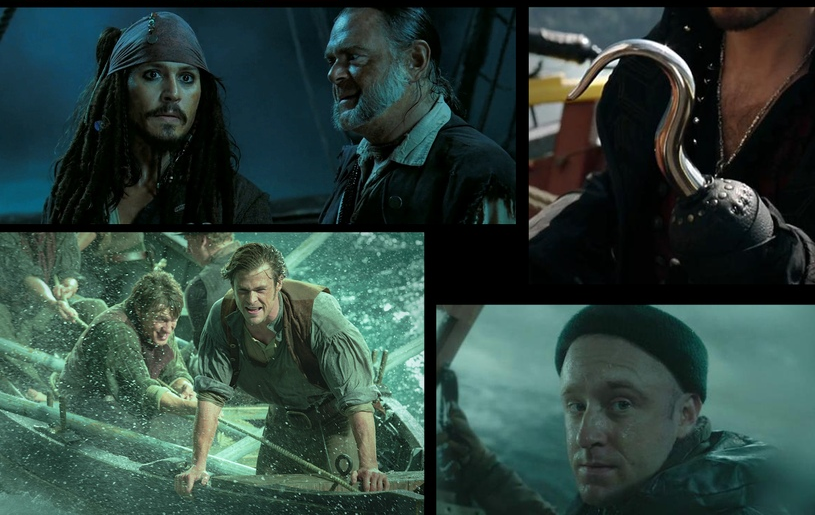
The purpose of the mood board is not to be used as a source to copy from, but to study how the materials behave and what they look like under different lighting. If you have enough time, you could even go as far as creating several quick studies from the reference materials to understand how things work in practice. This also applies to poses, angles, outfits etc. Over time, your visual library will grow and you will have an easier time drawing things “from your head”.
The author of this work is trying to work with a composition containing multiple characters and is looking for a solution within a closely matching color scheme. It is not an easy task to accomplish. To improve your skills you should continue to work on filling in the gaps in your knowledge. Go over all the details of the drawing and study them. You can also take some time to go back and look at the works of the masters to see how they handled composition, color and tone. Do some black and white studies to improve your understanding of tone and contrast. Analyze the properties of different materials in a variety of environments, study anatomy, volume of folds etc.
Stay tuned for more feedbacks on test assignments!

Email: info@sunstrikestudios.com

Message on WhatsApp

Kallipoleos 3, office 102, 1055 Nicosia, Cyprus
Sun Strike Gaming Ltd.

© «SunStrike Studios» 2016-2026
We use cookies to personalise content and ads, to provide social media features and to analyse our traffic. We also share information about your use of our site with our social media, advertising and analytics partners who may combine it with other information that you've provided to them or that they've collected from your use of their services.