

Game Art Styles: 7 Options and How to Choose
A game art style is the most expensive decision a project makes twice. Choose it early and the whole asset library inherits one set of rules; change it in month eight and every finished asset becomes a revision ticket. Yet most style discussions stop at mood boards, which is where the trouble starts - a mood board shows what the first screenshot could look like, not what asset four hundred will cost.
This guide walks through the seven video game art styles studios actually commission, what each one demands from production, and how to pick one against constraints rather than taste. It covers 2D game art styles and 3D game art styles side by side, because most projects end up mixing both. The examples are our own: our artists have shipped realistic vehicles, painterly match-3 scenes, isometric city builders, low-poly stylized characters and flat vector UI, which means the trade-offs below are the ones we have paid for.
Key takeaways:
- Seven styles cover almost all commissioned game art: realistic, semi-realistic, casual cartoon, painterly 2D, flat vector, low-poly stylized 3D, and isometric.
- Isometric is a camera constraint rather than a surface treatment, but it changes production so much that teams choose it like a style.
- Cost order per asset, cheapest first: flat vector, casual cartoon, low-poly, isometric, painterly 2D, semi-realistic, realistic.
- Style choice follows four constraints in order: screen size, genre readability, device budget, and the team you can staff for two years.
- The style guide matters more than the style: consistency across hundreds of assets is what players read as quality.
What a Game Art Style Actually Is
A game art style is a repeatable set of rules for turning reality into assets. Those rules cover four things: how much geometric detail survives, how light and material behave, how colour is limited, and how edges are drawn. Everything else people call style, including the mood board, is downstream of those four decisions.
The practical test of a style is not whether the first concept looks good. It is whether two artists who have never spoken can produce assets that sit next to each other without a seam. That only happens when the four rules are written down and enforced, which is why style work always splits into two phases: invention, then codification.
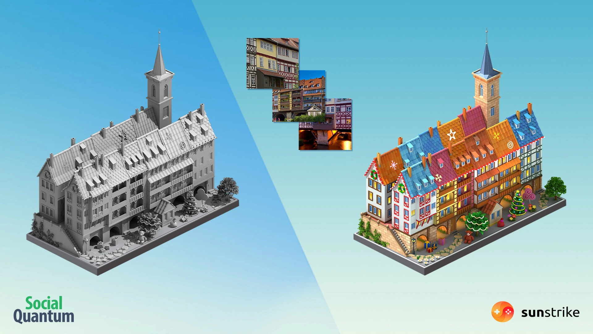
The Megapolis asset above is what style rules look like in practice. Real timber-framed houses went in as reference, the geometry was built to an isometric grid, and the finish applied the game’s rules: saturated roofs, warm windows, simplified brick, no material read that needed more than one glance. The reference is recognisable in the result, and none of the reference’s actual colour or lighting survived.
Realistic and AAA-Fidelity Art
Realistic game art aims for materials and lighting a player would accept as photographic, and it is the most demanding style to produce. It needs dense reference, high-poly sculpting, physically based rendering materials authored to real-world values, and lighting that holds up when the camera stops moving.
The style earns its cost in two situations: when the camera gets close and stays there, and when the fantasy depends on believability. Military vehicles, weapons and hard-surface props are the clearest case - a player who knows what a tank looks like will notice a wrong weld. Our team has built high-poly military vehicles for Armored Warfare, where reference discipline mattered more than artistic flourish.
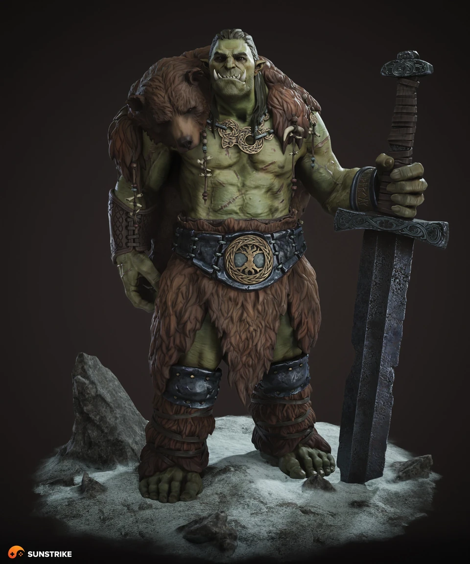
Note what realism does not mean. The orc above is a fantasy creature with green skin, and the style is still realistic: skin pores, fur clumps, leather wear and metal oxidation all follow real material behaviour. Realism is a treatment of surface and light, not a restriction on subject matter. Teams that conflate the two end up asking for realistic art when they wanted grounded art, which is a much cheaper request.
Where realistic art goes wrong on mobile is thermal budget. A device that renders your hero at 60 fps for ninety seconds and then throttles has not passed the test, and that failure surfaces late, after the assets exist. If a project is heading toward realism, our 3D game art production team sets the device matrix before the first sculpt, not after.
Semi-Realistic: The Mobile Middle Ground
Semi-realistic art keeps believable anatomy and proportion while simplifying surface detail and pushing colour past reality. It is the default register for mid-core mobile, interactive stories, RPGs and most casino art, because it reads as premium on a small screen without paying for full material fidelity.
The style works by deciding what to keep. Faces keep structure but lose pores. Fabric keeps folds but loses weave. Metal keeps its highlight but loses micro-scratches. Lighting stays soft and directional so forms stay legible at thumbnail size, which matters because a store listing is where most players first meet the art.
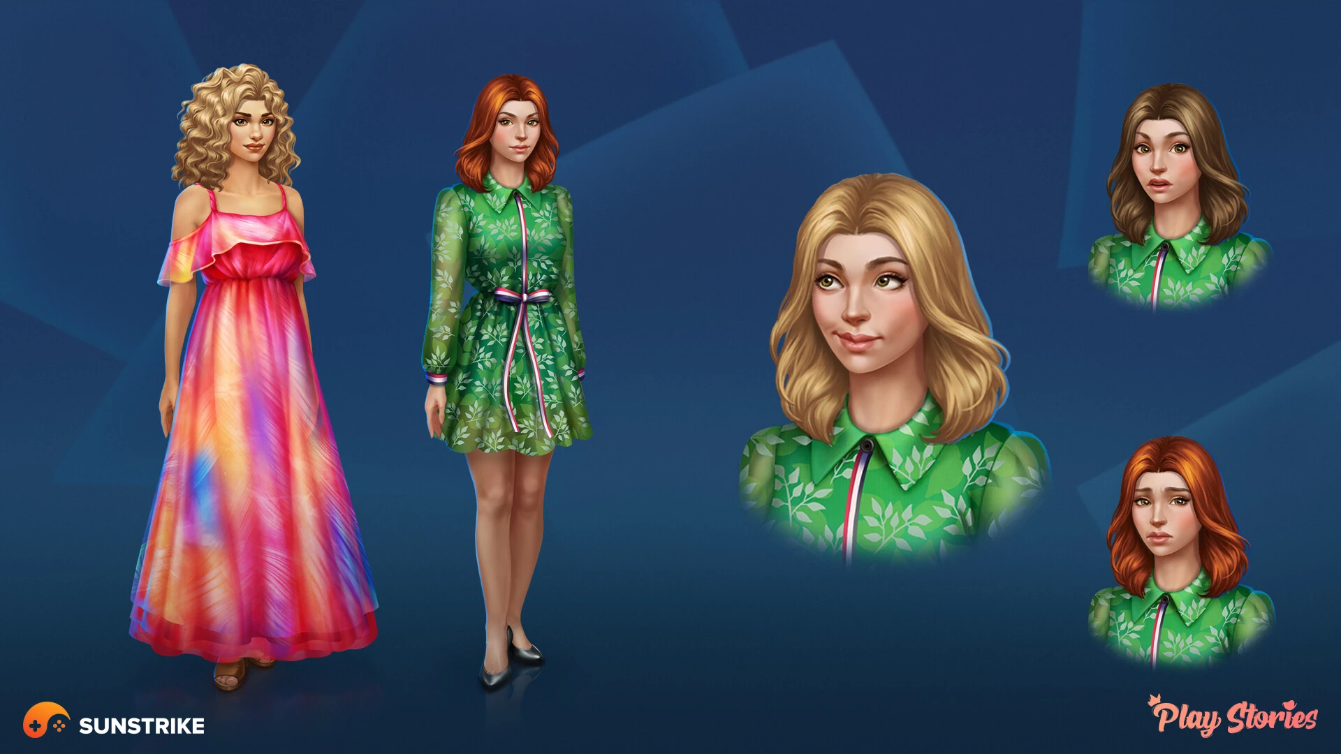
Semi-realistic character work has a production quirk worth planning for: variants multiply. The set above ships full bodies, portrait crops, and separate emotion states, because a story game shows the same character several hundred times and needs her expression to carry the scene. Budget the variant matrix at the brief stage - it is usually three to five times the asset count a first-pass estimate assumes.
Casual Cartoon: Glossy, Readable, Cheap to Scale
Casual cartoon style uses simplified shapes, thick forms, saturated colour and a glossy highlight pass to make objects instantly readable at small sizes. It dominates match-3, merge and hyper-casual because it survives the two hardest conditions in mobile: a two-inch render and a player who is not looking carefully.
Readability is the whole engineering problem. Every object needs a silhouette recognisable in one glance, and objects on the same screen need distinct silhouettes from each other. That is why casual assets exaggerate: a chest is rounder than a real chest, a crystal is more symmetrical, and the highlight sits in the same place on every object because consistency is faster to read than accuracy.
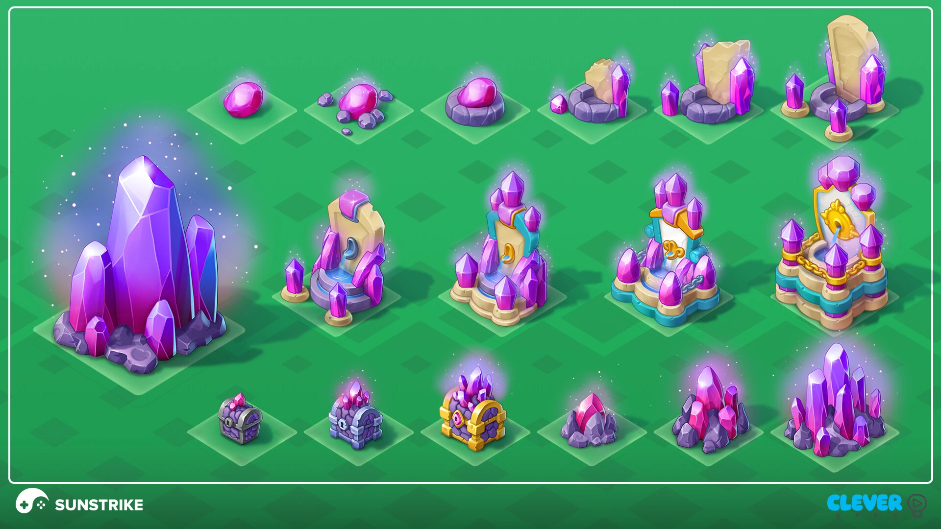
The tier logic above is the part teams underestimate. In a merge or match game the art carries progression, so tier six has to look like an upgrade of tier five before any number appears on screen. That is a rule set, not an aesthetic: each step adds one visual privilege - more crystals, then a base, then gold, then a frame - and never adds two at once.
Casual cartoon is also the cheapest style to scale after lock, which makes it the right answer for live games that ship content weekly. Our 2D game art studio runs most live-ops content in this register for exactly that reason.
Painterly 2D: Hand-Painted Scenes
Painterly 2D art keeps visible brushwork and painted light instead of resolving surfaces into clean shapes. It is the style of choice for hidden-object, story and puzzle-adventure games, where the background is not scenery but the thing the player searches, reads and returns to.
What painterly art buys is atmosphere per pixel. A painted scene can carry time of day, weather and mood in the same pass that describes the objects, because the light is painted rather than calculated. What it costs is reuse: a hand-painted scene is one scene. Rotating the camera, changing the hour, or reskinning for a seasonal event means repainting, not re-rendering.
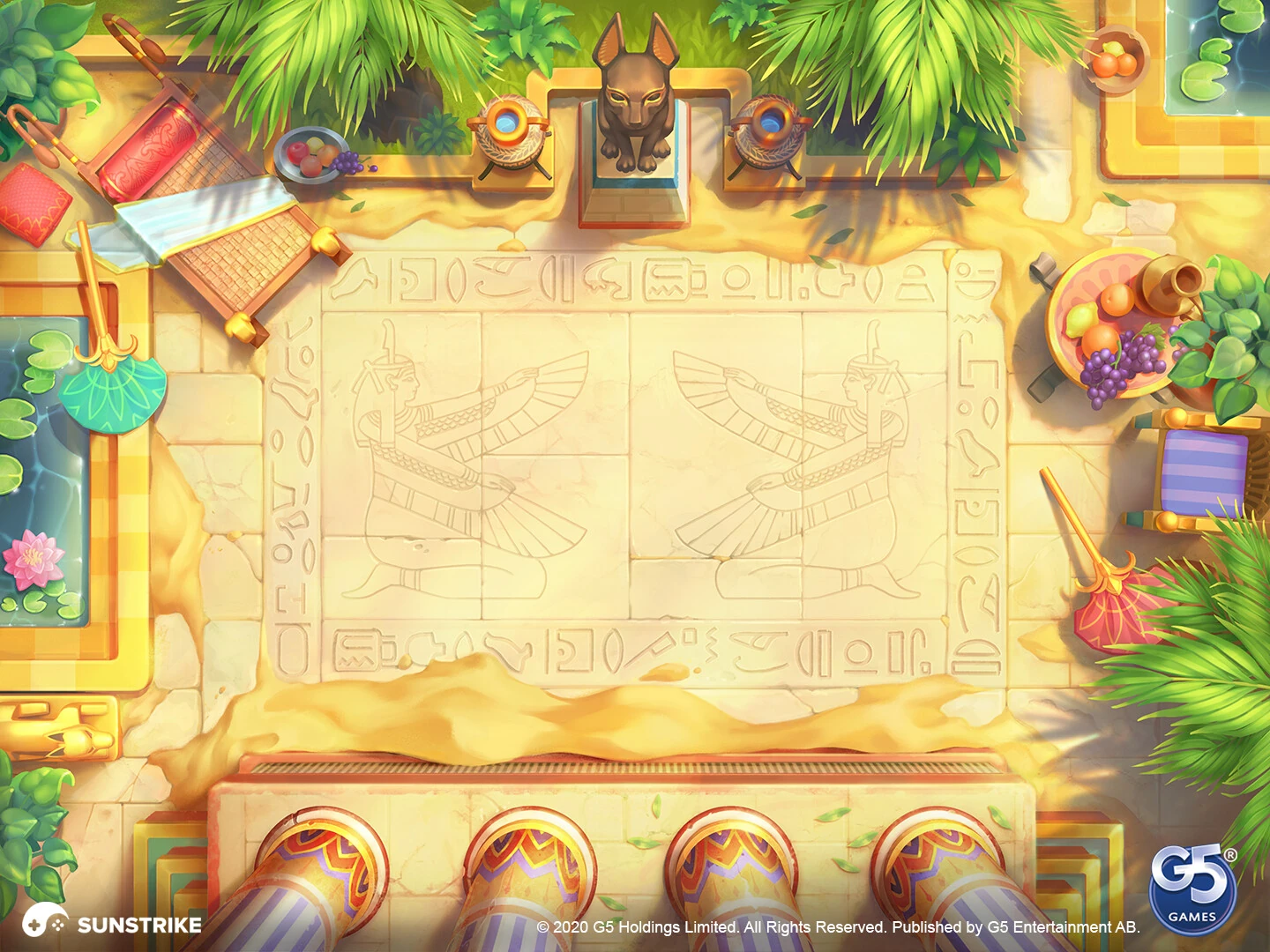
Notice the composition constraint. The centre of that courtyard is deliberately quiet, because the match-3 grid sits on top of it. Painterly backgrounds for puzzle games are painted around a hole, and any detail that wanders into the hole is wasted work at best and a readability bug at worst. We cover this in more depth in our guide to video game backgrounds.
Flat Vector and Cel-Shaded Art
Flat vector art uses solid fills, uniform outlines and no rendered lighting, which makes it the cheapest style to produce and the easiest to keep consistent. Cel shading is its 3D cousin: real geometry and real lights, quantised into flat bands so the result reads as drawn rather than rendered.
The economics are unusual here. With no lighting model to solve, an artist can produce several finished assets a day, palettes can be swapped globally, and a new artist reaches style parity in days rather than weeks. That is why flat vector owns UI work almost universally, including in games whose world art is fully realistic.
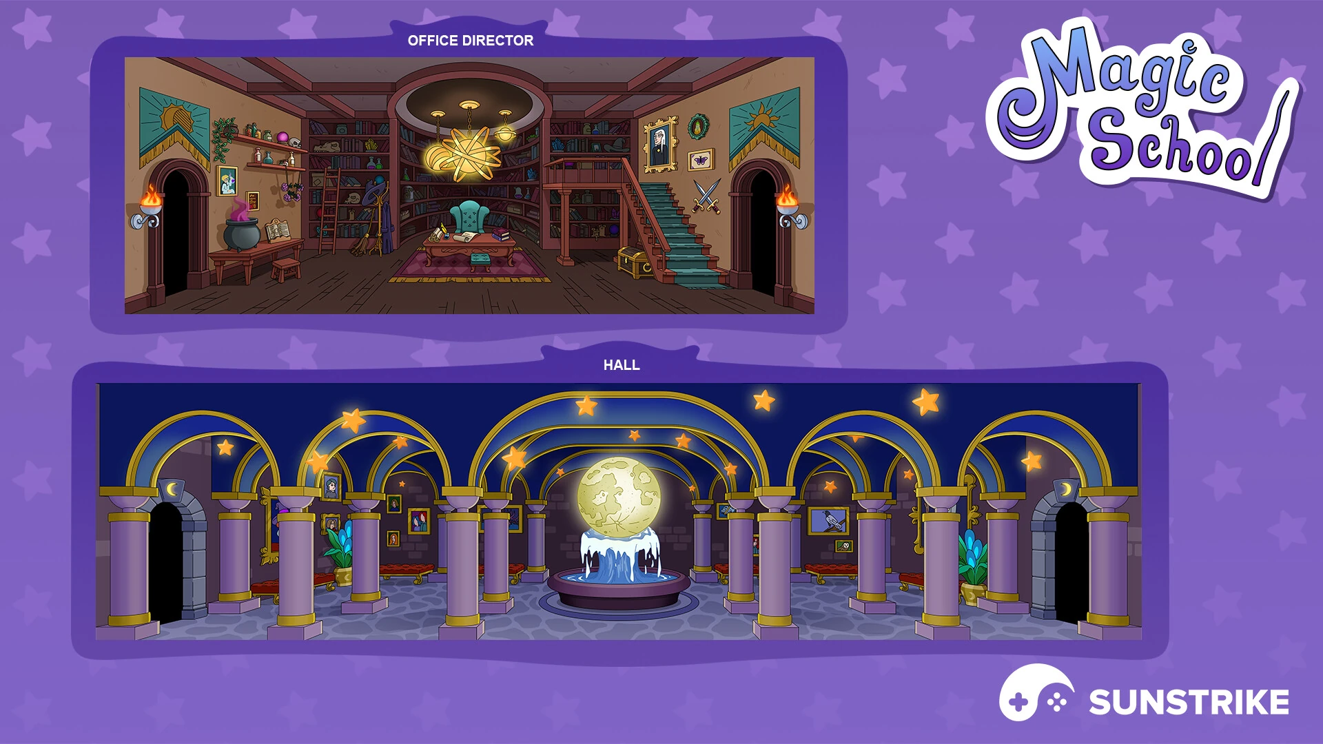
The limit of flat vector is depth. Without rendered light, distance has to come from overlap, scale and value grouping alone, which is why flat scenes tend toward the theatrical - layered flats, like stage sets. Teams that want both flat readability and rendered depth usually end up with cel shading in 3D instead, accepting shader work in exchange for a rotatable camera. The authoring decision underneath this one - vector or raster source files - is a separate question, and it applies to every style in this guide, not just the flat one.
Low-Poly and Stylized 3D
Low-poly stylized 3D keeps polygon counts deliberately low and puts the artistry into hand-painted textures and silhouette. It is the workhorse style for mobile 3D, survival and city-builder games, where hundreds of objects need to exist on screen inside a strict draw-call budget.
The craft sits in what the geometry does not do. A low-poly character has no modelled fur, wrinkles or micro-detail; all of that lives in the texture, painted to imply light that the mesh cannot produce. Silhouette carries the character recognition, because at gameplay distance the silhouette is most of what a player sees.
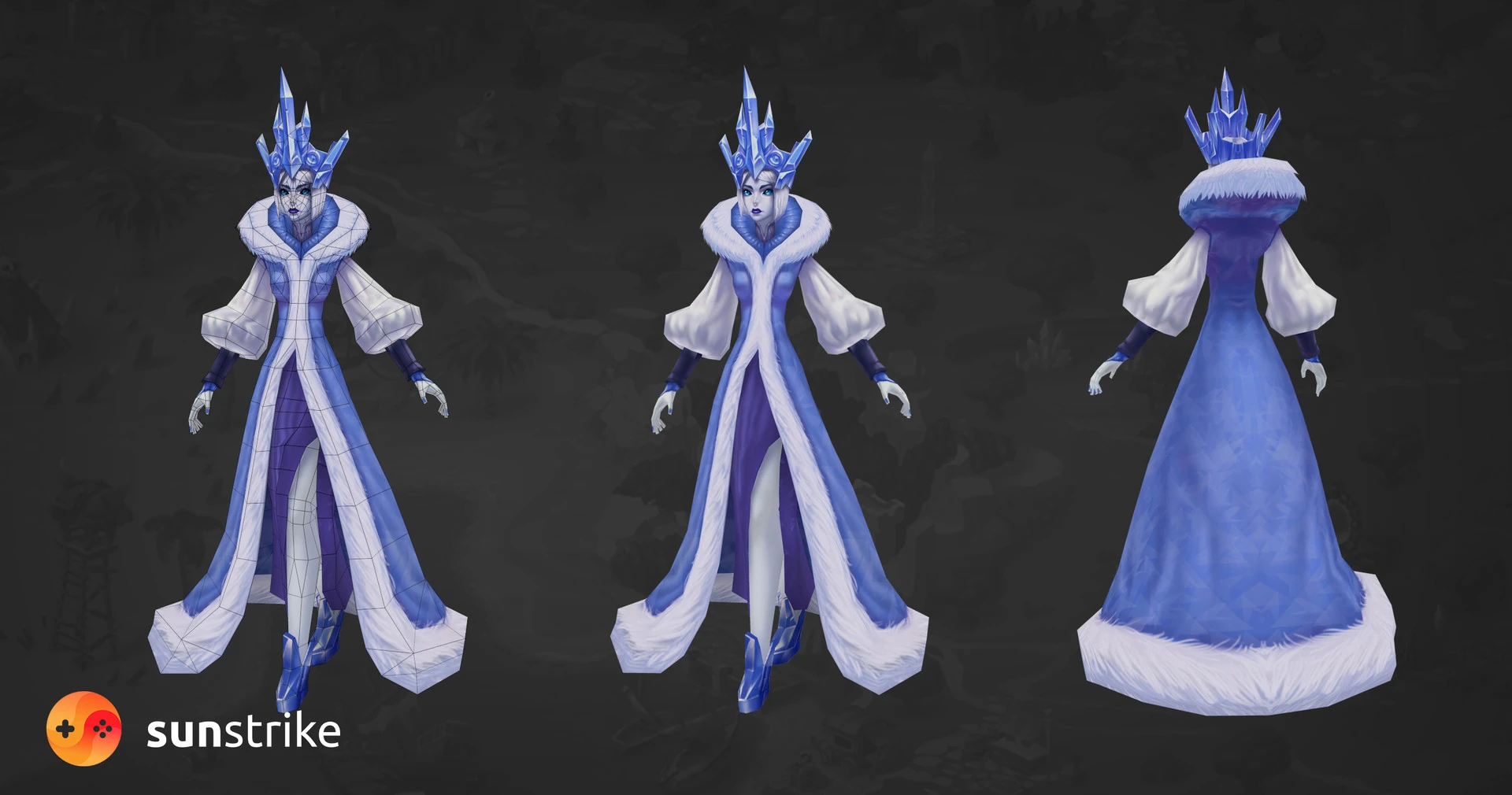
Compare the wireframe with the finish. The fur trim reads as soft, and there is no geometry making it soft - the texture does the work. That is the whole low-poly bargain, and it is a bargain worth understanding before choosing: the style shifts cost from modelling to texture painting rather than removing it. Our breakdown of high-poly versus low-poly goes through the budget maths in detail.
Isometric: A Camera Rule That Behaves Like a Style
Isometric art is not a surface treatment - it is a fixed camera at a fixed angle with no perspective convergence. It belongs in a style discussion anyway, because that single constraint reshapes production more than most stylistic choices do.
Three consequences follow immediately. Every asset must tile to the same grid, or buildings will not sit on the ground plane. Every asset is authored at one angle, so the back of a building may never be built. And lighting direction is locked globally, which is both a discipline and a gift: shadows become predictable, and assets from different artists match more easily than in any free-camera project.
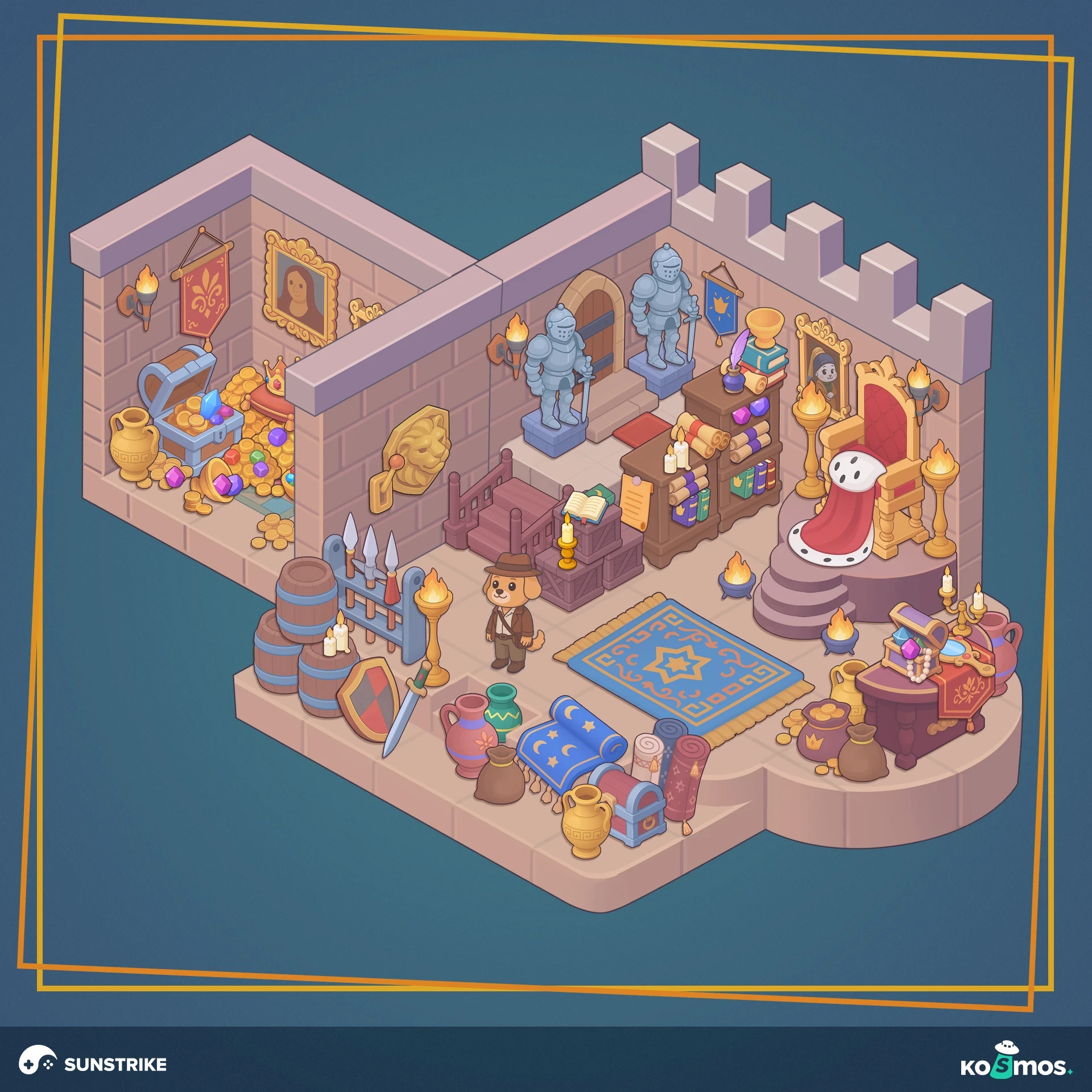
Isometric pairs with any surface style. The diorama above is flat-stylized; Megapolis at the top of this article is semi-realistic and isometric; survival games routinely run low-poly 3D under an isometric camera. When a project says “isometric style”, the useful follow-up question is which surface style rides on top, because that is where the cost actually varies.
How to Choose a Game Art Style
Choose an art style against four constraints, in this order: screen size, genre readability, device budget, and staffable team. Taste enters after those four, not before, because taste is the only one of the five you can satisfy in several different ways.
- Screen size. A two-inch phone kills detail. Below roughly a 5 mm on-screen height, texture detail is noise, and only silhouette and value survive - which pushes toward cartoon, flat or semi-realistic registers.
- Genre readability. Match-3, merge and puzzle games need instant object distinction. Story games need faces that carry emotion. Shooters need silhouette-first enemy recognition. The genre usually names two acceptable styles and rules out four.
- Device budget. Realism and dense scenes compete for the same headroom. If the target matrix includes four-year-old Android devices, the ceiling is set before art direction opens its mouth.
- Staffable team. This is the constraint teams skip and regret. A style is only real if you can hire or contract five artists who reproduce it consistently for two years. Highly personal styles are wonderful for a vertical slice and dangerous for a live game.
Only then does taste and market positioning arrive - and it should, because two styles that pass all four constraints are genuinely a choice. Our longer piece on realism versus stylization works through that final judgement call by audience and genre.
What Each Style Costs to Produce
Style is one of the three biggest cost drivers in a game art budget, alongside asset count and animation scope. The spread between the cheapest and the most expensive style is roughly twenty-fold per asset, which is why style choice moves a budget further than almost any other art decision. As rough 2026 market anchors, for one finished mid-complexity asset:
- Flat vector object or icon: $40-120.
- Casual cartoon object: $80-250.
- Low-poly stylized 3D prop: $150-400.
- Isometric building or diorama: $300-900.
- Painterly 2D background: $600-2,000.
- Semi-realistic character, 2D: $400-1,200.
- Realistic PBR character or vehicle: $2,000-8,000.
Two adjustments matter more than the numbers. First, exploration is a separate line: inventing a style costs two to six weeks of concept work before the first production asset exists, and stylized directions cost more here than realistic ones because there is no reality to defer to. Second, per-asset cost falls as a set grows - the tenth asset in a locked style is far cheaper than the first, which is why changing style mid-project is so expensive. You do not pay for one asset again; you pay for the discount you had already earned.
Why a Style Guide Matters More Than the Style
A style guide is what converts an art direction into a production system, and its absence is the most common reason good art looks cheap in aggregate. Players rarely judge a single asset. They judge whether four hundred assets agree with each other.
A working guide is short and testable. Ours typically pin down: light direction and colour temperature, outline rule, palette with permitted saturation range, material shorthand for the four or five surfaces the game repeats, silhouette and readability targets at actual on-screen size, and the polygon or resolution budget per asset class. Anything an artist has to guess becomes a seam.
The test for a guide is the onboarding test: hand it to a competent artist who has never seen the project, along with three reference assets, and ask for a fourth. If what comes back needs more than one revision round to match, the guide is describing a mood rather than a style. That test is also how we onboard artists onto client style families, whether the family is our own or arrives with the brief.
Where Teams Get Game Art Styles Wrong
Four failures account for most style problems we are asked to rescue, and none of them are about talent. They repeat across studio size and genre: a style validated on the wrong surface, a style named instead of defined, a style locked before the spec, and a style changed too late. Each is cheap to avoid, expensive to fix.
- Choosing from key art. Key art is built for stores at one size with unlimited hours per pixel. Gameplay art is built for thumbnails at scale. A style validated only on key art tends to collapse when it meets the real camera distance.
- Naming a style instead of defining it. “Stylized realism” and “AAA cartoon” are not briefs. Two artists will read them differently and both will be right. Rules and reference assets are the brief.
- Locking style before the technical spec. Engine, target devices, shader budget and animation approach all constrain style. Deciding the look before the constraints means either rework or a quiet quality drop when the constraints assert themselves.
- Changing style at the wrong moment. Style change is cheap during exploration, survivable at ten finished assets, and brutal at two hundred. If a change is coming, front-load the decision - the discount you lose grows with every asset already approved.
The Takeaway
There is no best game art style, only a style that fits a screen size, a genre, a device matrix and a team. Each of the seven registers moves cost between exploration, modelling, texturing and optimization rather than removing it. What separates expensive-looking projects from cheap ones is rarely the style - it is whether the rules were written down early.
The seven registers in this guide cover almost everything commissioned today, and the same four constraints decide between them every time.
Our artists work in all seven, often several at once inside one client family, from realistic vehicles and semi-realistic story characters to painterly puzzle scenes, flat vector UI, low-poly survival props and isometric city builders. If you are choosing a direction now, the portfolio shows each style in context, and our 2D and 3D teams can pressure-test a style against your constraints before it becomes four hundred assets.